Understanding Your Report
Understanding Your Front Page
This page displays the title of the report, which corresponds to the name provided when requesting it.
How to Read This Page
The grades range from A to E, with A being the best performance.
The same grading system applies throughout the report for every criterion.
Global Spider Chart Overview
Below is the spider chart summarizing the six global criteria of your report:
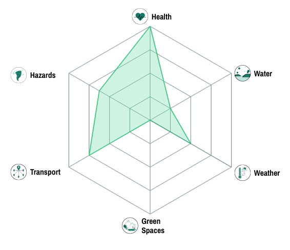
How to read it:
The chart is shaped like a spider web.
Each axis represents one of the six criteria.
The letter E is located at the center, while A is at the outer edge.
The farther the point is from the center, the better the score.
A balanced, wide shape indicates strong overall performance across all domains.
Each criterion’s detailed explanation and score can be found in its dedicated section later in the report.
At the end of the report, you will also find a section listing all data sources used for the analyses.
Understanding Your Health Report
Your Environmental Health Score
The overall score (from A to E) evaluates air quality around your address and access to healthcare infrastructure.
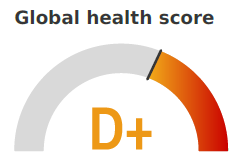
Letter Interpretation
A: Excellent quality - Very healthy air, full compliance with the European Union Ambient Air Quality Standards EU Air Quality Standards
B: Good quality - Healthy air most of the time, few rare exceedances
C: Average quality - Moderate pollution episodes
D: Poor quality - Regular pollution, vigilance required
E: Bad quality - Frequent pollution, health risk
Page 1: Air Quality Overview
Key Indicators
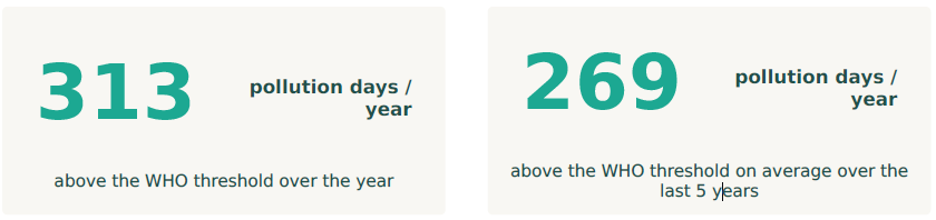
This number tells you how many days the air quality exceeded the European Union Ambient Air Quality Standards.
Two values are shown:
This year: Current situation (last 365 days)
5-year average: Historical reference (last 5 years)
Comparing these two helps you see if air quality is improving or getting worse over time.
Charts
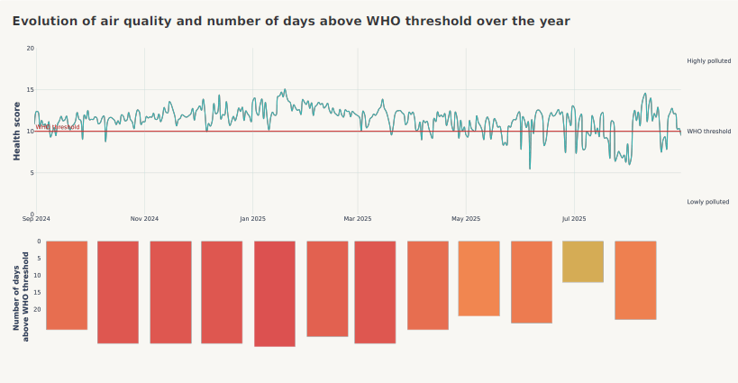
Daily Evolution Chart
This chart shows how air quality varies day by day throughout the year.
Red line: EU standard threshold
Above the line = Concerning pollution levels
Below the line = Good air quality
The higher the curve peaks, the higher the pollution
How to read it:
A stable, low curve means consistently good air
Upward spikes indicate pollution episodes (often related to weather conditions or traffic patterns)
Monthly Histogram
This chart breaks down polluted days (above EU standard threshold) month by month.
Colors range from green (few polluted days) to red (many polluted days)
Helps identify critical periods (for example, winter months often show more pollution due to heating)
Page 2: Detailed Analysis and Healthcare Infrastructure
Two Types of Exposure
Pollution Peaks (Short-term Exposure)
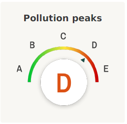
Measures the intensity of the worst days of pollution, over the last year.
Who should pay attention? People with asthma, allergies, respiratory diseases, elderly individuals…
Health impact: Risk of acute symptoms during pollution episodes (breathing difficulties, heart strain)
What a poor score means: A D or E score indicates frequent or intense pollution peaks. During these periods, consider limiting outdoor activities.
Long-term Exposure
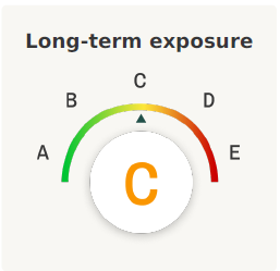
Measures average daily pollution levels, over the last year.
Who should pay attention? Everyone - this affects long-term health
Health impact: Cumulative effects over months and years (increased risk of cardiovascular disease, chronic respiratory conditions, and certain cancers)
What a poor score means: A D or E score suggests persistent pollution, which may have long-term health impacts.
Understanding Your Scores Together
Example 1
Score A in “Long-term Exposure” + Score D in “Peaks”
Meaning: Air is generally good, BUT there are some intense pollution episodes
Action: Monitor air quality alerts and adjust outdoor activities during peak days
Example 2
Score D in “Long-term Exposure” + Score A in “Peaks”
Meaning: Moderate but constant pollution without extreme episodes
Action: Consider long-term health implications, especially for vulnerable family members
5-Year Evolution Chart
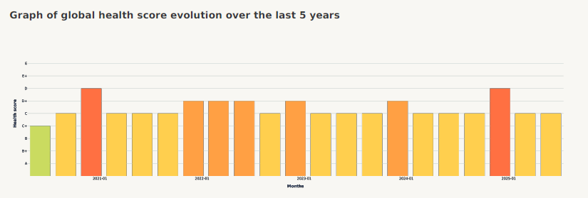
Shows your location’s air quality trend over time.
Colored bars represent the overall score per quarter since 2020
Green trend (improving grades) = Air quality getting better
Red trend (declining grades) = Air quality deteriorating
Helps you understand whether conditions are likely to improve or worsen
Access to Healthcare
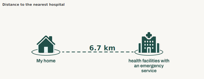
Distance in km (measured in a straight line, as the crow flies)
Search radius: 100 km
Provides context for healthcare accessibility at your location
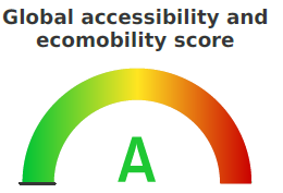
Understanding Your Transportation Report
Your Overall Accessibility Score
The overall score (from A to E) evaluates how well connected your address is to transportation options - both for long-distance travel and daily local mobility.
Letter Interpretation
A: Excellent - Well-connected to all transport types
B: Good - Good access to most transport options
C: Average - Moderate connectivity
D: Limited - Some transport gaps
E: Poor - Limited transportation access
Page 1: Long-Distance Accessibility
What is Accessibility?
Accessibility measures how easily you can reach major transportation hubs for long-distance travel: train stations, airports, and highway networks.
Your Accessibility Sub-Score
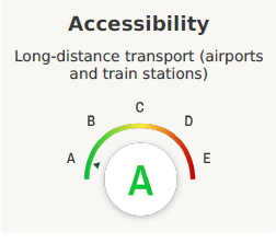
This score considers:
Proximity to train stations - Presence within 5 km
Proximity to airports - Presence within 25 km
Access to highway networks - Presence within 2 km, 3 km, or 5 km (depending on network density)
Why it matters:
For commuters: Easy access to regional/national transport
For travelers: Convenient long-distance travel options
For emergencies: Quick access to major transport routes
Key Indicators
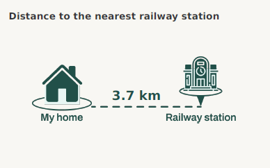
Distance in km (measured in a straight line)
Important for: Regional commuting, intercity travel
What’s considered good: Under 5 km
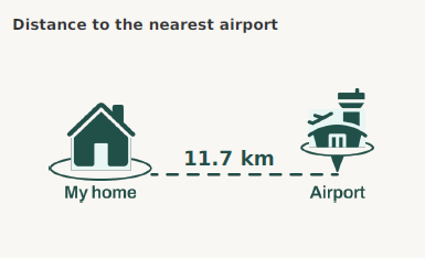
Distance in km (measured in a straight line)
Important for: International/domestic air travel
Note: Actual travel time may vary due to traffic and road networks
What’s considered good: Under 25 km
Accessibility Map
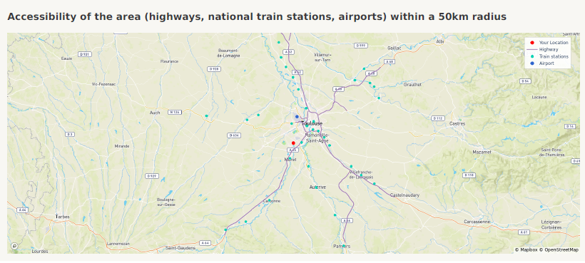
The map shows major transport infrastructure within 50 km:
Your location (red marker)
Train stations (blue markers)
Airports (darker blue markers)
Highways (purple lines)
Page 2: Local Ecomobility
What is Ecomobility?
Ecomobility measures access to sustainable, eco-friendly local transportation: public transport (buses, metro) and cycling infrastructure.
Your Ecomobility Sub-Score
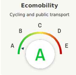
This score considers:
Public transport availability (buses, metro) - Presence within 1 km
Cycling infrastructure - Presence within 2 km
Walkability to transport stops - Presence within 1 km
Why it matters:
Environmental impact: Lower carbon footprint
Daily convenience: Easy car-free living
Health: More active transport options
Cost savings: Reduced need for private vehicle
Key Indicators
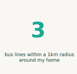
Number of distinct bus lines accessible from your location
Shows diversity of public transport routes
More lines = more destinations accessible
What’s considered good: 5+ bus lines
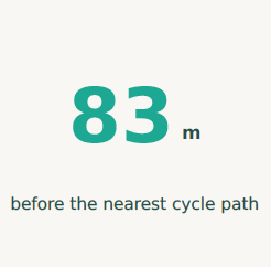
Distance in meters (measured in a straight line)
Important for: Safe cycling
What’s considered good: Under 500 meters
Ecomobility Map
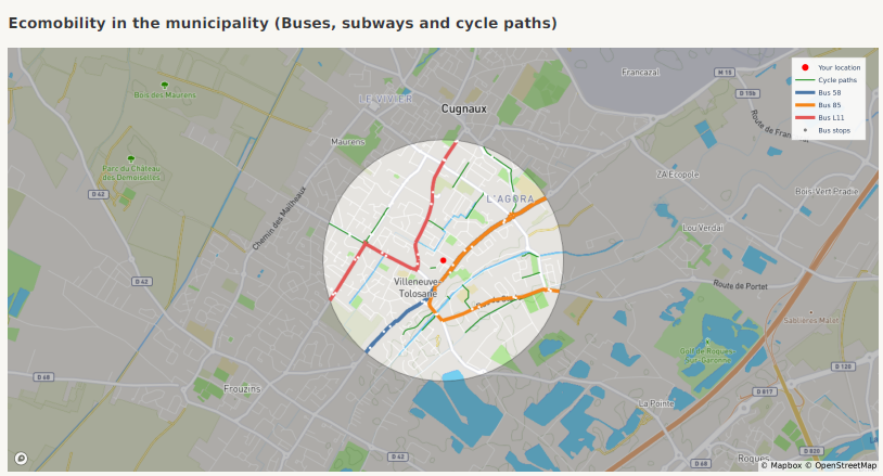
The map shows local sustainable transport options:
Your location (red marker)
Bus lines (colored lines, one color per line)
Bus stops (grey markers)
Metro lines (if available, colored lines)
Metro stations (if available, orange markers)
Cycle tracks (green lines)
How to read the map:
Dense networks = better connectivity
Multiple line colors = diverse route options
Green coverage = good cycling infrastructure
Understanding Your Scores Together
Example 1: Score A in Accessibility + Score C in Ecomobility
Meaning: Great for long-distance travel, but limited daily sustainable options
Best for: People who travel frequently but drive locally
Consider: May require a car for daily activities
Example 2: Score C in Accessibility + Score A in Ecomobility
Meaning: Excellent for car-free daily living, but less convenient for long trips
Best for: People working/living locally with occasional long-distance needs
Consider: Long-distance travel may require more planning
Example 3: Score A in both
Meaning: Well-connected on all fronts
Best for: Maximum flexibility in transportation choices
Data Source and Limitations
All transportation indicators are derived from OpenStreetMap (OSM), a collaborative global database of geospatial data. OSM is an excellent source because it offers open, detailed, and regularly updated transport infrastructure data.
However, its community-driven nature means that:
Data completeness may vary by region.
Some infrastructures (especially new or minor ones) may not yet be mapped.
Update frequency depends on local contributors — resulting in occasional delays between real-world changes and OSM updates.
These limitations should be kept in mind when interpreting accessibility and ecomobility scores.
Understanding Your Weather Comfort Report
Your Overall Weather Comfort Score
The overall score (from A to E) evaluates thermal comfort conditions based on air temperature, wind speed, and precipitation patterns.
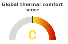
Letter Interpretation
A: Excellent - Comfortable conditions year-round
B: Good - Generally comfortable with minor seasonal variations
C: Average - Noticeable discomfort in some seasons
D: Limited - Frequent uncomfortable conditions
E: Poor - Challenging climate conditions
Score Composition Details
Your overall weather comfort score is calculated based on three components:
Air Temperature (weight: 3 points): Based on the average of daily maximum temperatures across the year.
Wind Speed (weight: 1 point): Computed from the quarterly average of observed wind speeds.
Precipitation (weight: 1 point): Calculated from the quarterly total rainfall.
Each of these indicators contributes proportionally to the final letter grade (A–E), where A represents optimal comfort conditions.
Page 1: Temperature and Precipitation Overview
Understanding Seasonal Temperatures
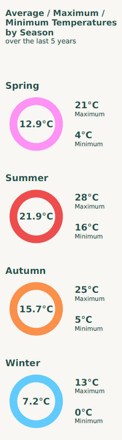
The left panel shows average temperature patterns for each season based on the last 5 years.
For each season, you’ll see:
Large colored circle: Average temperature
Maximum: Hottest typical temperature
Minimum: Coldest typical temperature
Seasonal Normals: Reference temperature for previous years
Why this matters:
High summer temperatures (>30°C) = Hot conditions, cooling needs
Low winter temperatures (<0°C) = Cold conditions, heating needs, potential for frost/snow
Large differences between max and min = More variable weather
Seasonal Normals Reference
Each season’s temperature panel also includes the seasonal normal, which represents the average temperature over the 1991–2020 reference period.
What is a seasonal normal?
A seasonal normal corresponds to the long-term climatological average for a specific season (Winter, Spring, Summer, Autumn). It serves as a baseline to compare current conditions with historical climate patterns, helping you identify whether your location is warmer, colder, or consistent with its usual climate.
Key Indicators

Total precipitation over the last 365 days.
“5-year average” comparison: Shows if this year is wetter or drier than usual
What’s normal? Varies by region
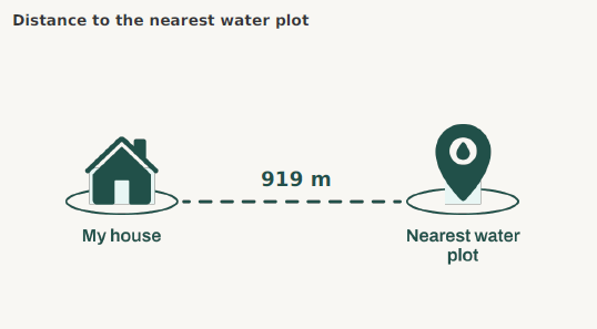
Straight-line distance to the closest lake, river, or water body.
Why it matters:
Water moderates temperatures (cooler in summer, warmer in winter)
Proximity for recreation
Can affect local humidity
Distance interpretation:
Under 500m: Strong cooling effect, easy access
500-1000m: Moderate effects
Over 1000m: Minimal impact
Temperature Evolution Chart
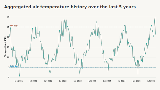
Shows typical temperature variations throughout the year.
Reference lines:
Blue (5°C): Cold day threshold
Orange (25°C): Hot day threshold
Page 2: Sunshine and Heat Islands
Key Indicators
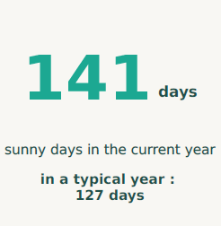
Days with strong sunshine (clear to mostly clear skies).
“5-year average” comparison: Shows the average number of sunny days over the past 5 years, helping you see if this year is sunnier or cloudier than usual.
Why it matters:
Solar energy potential
Outdoor activities
What’s good? Most people prefer 200-250+ sunny days/year, but very high counts (>300) in hot climates can mean excessive heat.
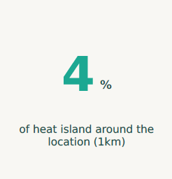
Percentage of urban area that’s significantly warmer than surrounding areas due to buildings, pavement, or lack of vegetation.
Percentage meaning:
0-10%: Minimal effect
10-30%: Moderate - noticeable on hot days
30-50%: Significant - impacts comfort and cooling costs
>50%: Severe - major discomfort during heat waves
Why it matters:
Health risks during heat waves (especially for elderly and children)
Higher cooling costs
Harder to cool buildings naturally
Monthly Sunny Days Histogram
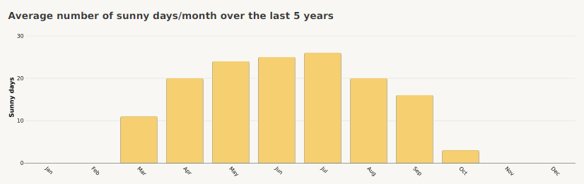
Shows typical sunny day distribution across months.
Patterns to notice:
Consistent bars = Stable sunshine year-round
High summer/low winter = Seasonal differences
Low bars overall = Frequently cloudy climate
Heat Islands Map
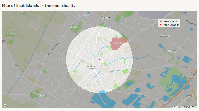
Shows which areas within 1 km are heat islands (red/pink areas).
Understanding Your Water Report
Your Overall Water Abundance Score
The overall score (from A to E) evaluates water resource availability and ecosystem health based on water stress levels and vegetation health indicators.
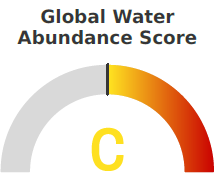
Letter Interpretation
A: Excellent - Abundant water resources, thriving vegetation
B: Good - Sufficient water availability, healthy ecosystems
C: Average - Moderate water stress, stable vegetation
D: Limited - Water stress concerns, declining vegetation health
E: Poor - Severe water stress, degraded vegetation
How the overall score is calculated:
The score combines two components with different weights:
Water Stress (80% weight): Pressure on water resources at watershed level
Vegetation Health (20% weight): Condition of local plant life
Both components are averaged across all seasons over the last 5 years to produce your overall letter grade.
Page 1: Water Resources and Ecosystem Health
Understanding Your Sub-Scores
Water Stress
Measures the pressure on water resources at the watershed level.
What it means: The ratio of water demand (from households, industry, agriculture) to available water supply
Scale:
0% (no stress) to 100% (complete depletion of available water)
Higher values = greater water scarcity risk
Why it matters:
High water stress affects drinking water availability
Impacts agriculture and vegetation health in the area
Affects long-term sustainability of the region
Your gauge score (A-E):
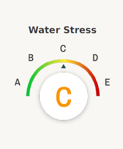
Based on mean water stress levels across the year
Data uses 2019 estimates based on long-term patterns (1979-2019), values are assumed stable year-to-year unless major infrastructure or climate changes occur
Vegetation Health
Measures the condition of plant life in your area.
What it means: An index based on vegetation greenness compared to its historical range for the same time of year
Scale: 0% (poorest condition relative to history) to 100% (best condition relative to history)
Reflects how well vegetation is thriving, which depends partly on water availability
Why it matters:
Healthy vegetation indicates adequate water and good ecosystem function
Affects air quality and urban cooling
Reflects overall environmental health
Can indicate drought conditions or climate stress
Your gauge score (A-E):
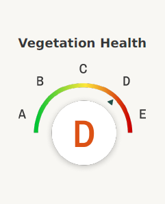
Based on mean vegetation health over the last year
Compares current conditions to the 2020-2023 baseline period
Water Stress and Temperature Chart
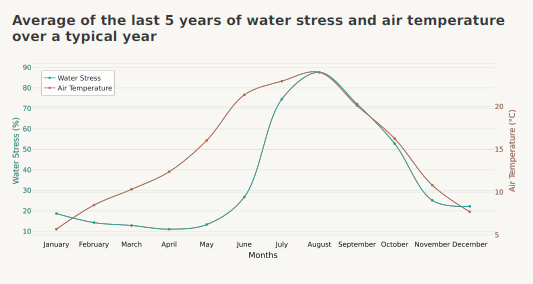
Shows how water stress varies throughout a 5-year average alongside temperature.
How to read it:
Blue line (left axis): Water stress percentage by month (based on 2019 data)
Orange line (right axis): Average temperature
Patterns to notice:
High summer temperatures often coincide with peak water stress
Winter months typically show lower stress (less demand, more available water)
The gap between lines indicates the relationship between temperature and water demand
Vegetation Health Map (Last 3 Months)
This map shows the vegetation health status (as a percentage) over the last three months, based on satellite observations of vegetation indices.
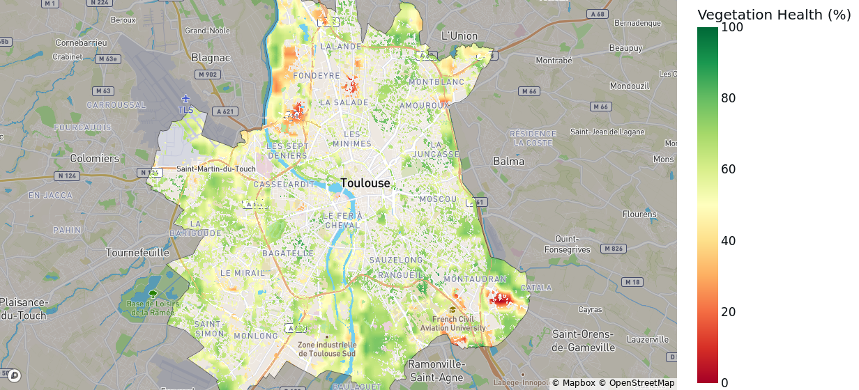
How to read it:
Green areas: Healthy vegetation with strong photosynthetic activity
Yellow/orange areas: Moderately stressed vegetation
Red areas: Vegetation under significant stress (low greenness and vitality)
Patterns to notice:
Consistent green areas indicate stable and resilient ecosystems
Expanding yellow or red areas may reflect recent droughts, land use changes, or seasonal transitions
Page 2: Local Water and Vegetation Details
Key Indicators
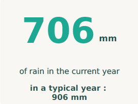
Total precipitation over the last 365 days.
Why it matters:
Direct measure of water input to the region
Affects water reserves, agriculture, and ecosystems
Helps contextualize current water conditions
“5-year average” comparison: Shows the 5-year average to help you understand if this year is wetter or drier than normal.
What’s typical? Varies greatly by region.
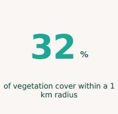
Percentage of the area covered by trees, shrubs, grasslands, and other vegetation (based on 2021 satellite data).
Percentage meaning:
0-20%: Very sparse vegetation (urban, desert, or agricultural)
20-40%: Limited vegetation cover
40-60%: Moderate vegetation
60-80%: Good vegetation cover
80-100%: Dense vegetation (forests, natural areas)
Why it matters:
More vegetation = better water retention in soil
Cooler local climate
Indicator of ecosystem health
Affects local air quality and biodiversity
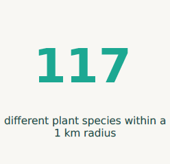
Count of distinct plant species observed in the area based on scientific databases (2020-2024 observations).
What the number means:
Higher diversity generally indicates healthier ecosystems
Reflects both natural habitats and cultivated areas
More species = more resilient to environmental changes
Important notes:
This count reflects observed and recorded species, not necessarily all species present
Scientific observation coverage varies by location
Urban areas typically have lower counts than natural areas
Vegetation Density Map
Shows where vegetation is concentrated within 1 km of your location, based on summer satellite imagery.
Vegetation density refers to a measure of “greenness” and photosynthetic activity, indicating how lush or sparse vegetation is in a given area.
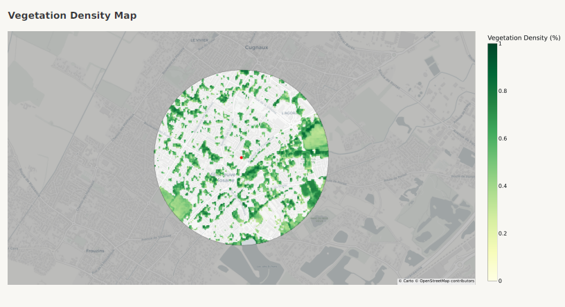
How to read it:
Color gradient: Yellow (sparse) to dark green (dense)
Red marker: Your location
White/blank areas: Non-vegetated (buildings, roads, bare ground)
What you can learn:
Identify nearby parks, forests, or green spaces
Understand how green your neighborhood is
See if vegetation is evenly distributed or concentrated in certain areas
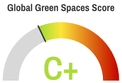
Understanding Your Green Areas Report
Your Overall Green Areas Score
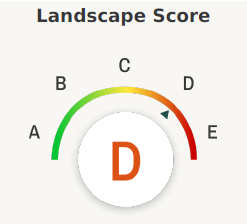
The overall score (from A to E) evaluates the ecological richness and natural quality of your surroundings, combining biodiversity (variety of habitats and species) with landscape characteristics (natural beauty and green space access).
Letter Interpretation
A: Excellent – A very high proportion of land with strong biodiversity value, hosting well-preserved natural or semi-natural habitats.
B: Good – Large areas of biodiversity-rich environments, supporting healthy ecosystems and wildlife presence.
C: Average – Moderate proportion of land contributing to biodiversity conservation, with some fragmented or managed natural areas.
D: Limited – Low proportion of areas maintaining natural biodiversity, with ecosystems under pressure or degradation.
E: Poor – Very limited or no land with significant biodiversity value; mostly urbanized or artificial environments.
Page 1: Biodiversity and Landscape Quality
Understanding Your Sub-Scores
Biodiversity
Measures the variety and quality of natural habitats within 1 km of your location.
What it means: Different habitat types (forests, wetlands, grasslands) support different species and contribute to ecosystem health
Based on: Scientific habitat classification from 2015-2019
Why it matters:
More diverse habitats = richer wildlife and plant life
Healthy ecosystems provide cleaner air and water
Greater resilience to environmental changes
More opportunities to connect with nature
Your gauge score (A-E):
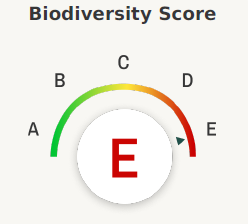
Areas with forests, wetlands, and natural water bodies score highest. Urban and desert areas score lower.
Biodiversity Habitat Mosaic
Mosaic showing the distribution of habitat types in the area according to the data used in the Biodiversity score. The aim is to illustrate which types of habitats are present and how they influence the biodiversity grade.
How to read it:
Square size: Each square represents a habitat type. Its size is proportional to the area it occupies compared to the total area studied.
Colors: The color of the squares reflects the ecological contribution of each habitat to biodiversity:
Red tones: Habitats with low or no contribution (closer to 0/5)
Green tones: Habitats that strongly support biodiversity (closer to 5/5)
Patterns to notice:
A zone dominated by artificial or desert habitats will tend to show lower biodiversity scores, reflected by large red or orange areas.
Conversely, a location containing significant forest, wetland, or grassland habitats will score higher and appear greener on the mosaic.
A balanced mix of several natural habitat types (forest, grassland, wetlands, savanna) generally indicates diverse ecosystems and strong ecological resilience.
Habitat Classes and Weights
Habitat Type |
Weight |
|---|---|
Forest |
5 |
Savanna |
4 |
Shrubland |
3 |
Grassland |
5 |
Wetlands |
5 |
Rocky Areas |
2 |
Desert |
1 |
Permanent Water Bodies |
5 |
Artificial |
0 |
These weights indicate how much each habitat type contributes to the overall Biodiversity score. Habitats with higher weights are key to sustaining rich and functional ecosystems, while artificial or barren areas have minimal ecological contribution.
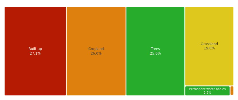
Landscape
Evaluates the aesthetic and recreational value of your surroundings.
What it means: How much natural beauty and green space exists nearby
Considers: Trees, water bodies, natural areas vs. built-up spaces
Based on: Satellite land cover data from 2021
Why it matters:
Natural landscapes improve mental wellbeing
Green spaces offer recreation opportunities
Scenic environments enhance quality of life
Tree cover provides cooling and air quality benefits
Your gauge score (A-E):
Tree-covered areas, water bodies, and wetlands score highest. Dense urban development scores lower.
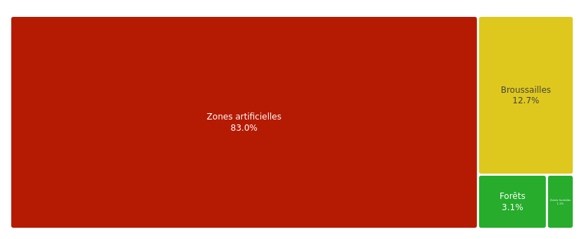
Landscape Land Use Mosaic
Mosaic showing the distribution of soil types in the area according to the land cover used in the Landscape score. The aim is to show which areas are present and what impact they have on the score.
How to read it:
Square size: Each square size for each land use type is proportional to the area it occupies in relation to the total area studied. The percentage below the name of the surface represents the percentage of this type of soil in relation to the total surface area of the area studied.
Colors: The color of the squares represents the impact of this type of surface on the score. Ranging from
red → the surface negatively impacts the score (bringing it closer to 0/5)
green → a type of surface that positively impacts the score (bringing it closer to 5/5).
Patterns to notice:
If the area studied is an urban area with a high concentration of built-up areas, the score will tend towards 0 and the graph will show a square and a significant percentage of surface area.
Conversely, a rural area with a high proportion of “Trees” or “Permanent water bodies” will tend to have a higher score, and the graph will show a high proportion of this type of land cover in the study area.
Land Cover Classes and Weights
Land Cover Type |
Weight |
|---|---|
Tree cover |
5 |
Shrubland |
3 |
Grassland |
3 |
Cropland |
2 |
Built-up |
0 |
Bare/Sparse vegetation |
2 |
Snow and ice |
1 |
Permanent water bodies |
5 |
Herbaceous wetland |
4 |
Mangroves |
5 |
Moss and lichen |
2 |
These weights represent how each land cover type contributes to the Landscape sub-score, helping visualize how natural or artificial surfaces influence the overall result.
Key Indicators
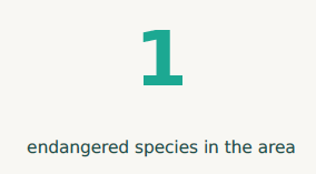
Number of at-risk species observed in a 1 km radius around you (2020-2024).
What this means:
These are species classified by conservation scientists as vulnerable, endangered, or critically endangered
Their presence indicates important habitat that needs protection
Higher counts can mean either: (1) crucial wildlife corridor, or (2) species under pressure
Important notes:
This count reflects observed and recorded species only
Not all species in the area may have been documented
Urban areas typically have fewer observations than natural areas
The species most frequently observed in a 1 km radius around you (2020-2024).
Why it matters:
Tells you what wildlife you’re most likely to encounter
Indicates the dominant ecosystem type in your area
Page 2: The 3-30-300 Green Space Rule
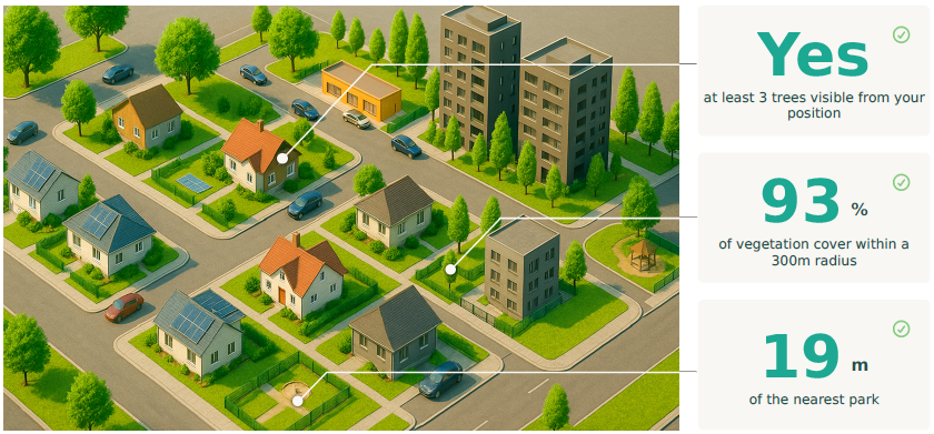
What is the 3-30-300 Rule?
This is a scientific standard for healthy urban green access, based on research showing that proximity to nature significantly improves mental and physical health.
The three benchmarks:
See 3 trees from your home
30% tree canopy in your neighborhood (500m radius)
Park within 300 meters of your location
Your 3-30-300 Assessment
Rule of 3: Can you see trees from your location?
What we check: Whether there are trees visible from your address
Method: Satellite analysis of vegetation at your specific point
Result: Yes or No
Why it matters:
Even a view of trees reduces stress and improves mood
Trees provide a sense of seasonal change and connection to natural cycles
Rule of 30: Is there 30% vegetation cover nearby?
What we check: Percentage of tree canopy within 500m
Result: Your actual percentage + whether you meet the 30% threshold
Why it matters:
Tree canopy cools neighborhoods, reducing heat stress
More trees = cleaner air and better stormwater management
Adequate canopy supports urban wildlife
Shaded streets encourage walking and outdoor activity
Rule of 300: Is there a park within 300 meters?
What we check: Distance to nearest green space larger than 5,000 m²
Result: Your actual distance + whether it’s under 300m
Why it matters:
Easy park access increases physical activity
Green spaces provide places for social interaction
Regular nature exposure linked to better mental health
300m is roughly a 3-5 minute walk - close enough for daily use
Understanding Your Results
Meeting all three rules (3/3):
Your location has excellent urban green access. Research shows this level of nature proximity is linked to better mental health, increased physical activity, and lower stress levels.
Meeting 2 out of 3:
Good urban green access with room for improvement. Consider how you might enhance the missing element (planting trees, visiting parks further away, etc.).
Meeting 1 or 0:
Limited nature access. While this is common in dense urban areas, consider:
Visiting nearby parks regularly, even if beyond 300m
Supporting urban greening initiatives in your neighborhood
Creating green space at home (window boxes, indoor plants)
Data Source and Limitations
All species occurrence data used in this section come from the GBIF — the Global Biodiversity Information Facility, an international open-access database compiling biodiversity observations from scientific institutions, research programs, and citizen-science initiatives worldwide.
How it works:
Each record in GBIF represents a species observation (animal, plant, or fungus) linked to a location, date, and source institution.
Observations are aggregated from multiple contributors, including museums, universities, and citizen platforms like iNaturalist.
The dataset is continuously updated, providing a large-scale and standardized view of biodiversity across regions.
Limitations:
Uneven sampling effort: Some areas (urban or remote regions) have fewer observations, leading to underrepresentation of local species.
Temporal bias: Many records come from past surveys and may not reflect the current ecological status.
Species detectability: Common or easily observable species are often overrepresented, while rare or cryptic ones may be missing.
Data validation: Although GBIF applies quality checks, some records may contain taxonomic or geolocation inaccuracies.
Despite these limits, GBIF remains the most comprehensive global source for biodiversity occurrence data and provides a robust foundation for estimating ecological richness in the report.
Understanding Your Natural Hazards Report
Your Overall Hazards Score
The overall score (from A to E) evaluates the exposure of your location to extreme weather events such as droughts, heat waves, and heavy rain episodes. It compares the last 10 years (e.g., 2015–2025) with climate projections for the next 10 years (e.g., 2026–2036), following the SSP3-7.0 scenario — which assumes a continuous increase in greenhouse gas emissions.
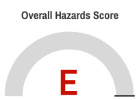
Letter Interpretation
A: Very low risk – Stable conditions, minimal increase in extreme events ( Days / year Variation : + 7 days )
B: Low risk – Slight increase in event frequency ( Days / year Variation : + 10 days )
C: Moderate risk – Noticeable rise in intensity or frequency ( Days / year Variation : + 13 days )
D: Significant risk – Frequent extreme weather events expected ( Days / year Variation : + 18 days )
E: High risk – Major increase in severe climatic phenomena ( Days / year Variation : > + 18 days )
Page 1: Past 10 Years Overview (2015–2025)
This page summarizes the historical occurrence of extreme events around your location, derived from climate datasets aggregated over the last 10 years.
Key Indicators
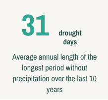
Average annual number of days without precipitation over the last 10 years.
What this means:
Indicates the average duration of the longest dry period each year.
Longer drought periods increase risks for water scarcity, vegetation stress, and agricultural impacts.
Why it matters: Droughts directly affect ecosystems and local economies, especially in regions relying on agriculture or sensitive vegetation.
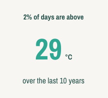
Local threshold for hot days, determined dynamically for your location.
What this means:
The threshold (e.g., 29 °C) represents the 98th percentile of daily maximum temperatures recorded during the past 10 years.
This method adapts to local climatic conditions — a hot day in a coastal area is not the same as in a mountain region.
Important notes:
The use of percentiles makes the indicator comparable across different periods.
It highlights unusually hot conditions relative to the historical norm for your area.
Why it matters: Helps quantify climate extremes in a way that’s relevant to your specific environment, rather than applying a fixed global temperature threshold.
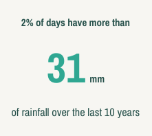
Local threshold for heavy rain days, determined from historical precipitation patterns.
What this means:
Defined as the 98th percentile of daily precipitation amounts over the last decade (2015–2025).
A day is considered “heavy rain” when it exceeds this value (e.g., 31 mm/day).
Important notes:
The percentile-based approach captures extreme rainfall specific to the local climate.
Unlike absolute thresholds, it reflects how intense rainfall is relative to typical conditions in your region.
Why it matters: Identifies areas subject to intense rainfall or flash flood risks, crucial for understanding local hazard exposure.
Extreme Weather Events Chart
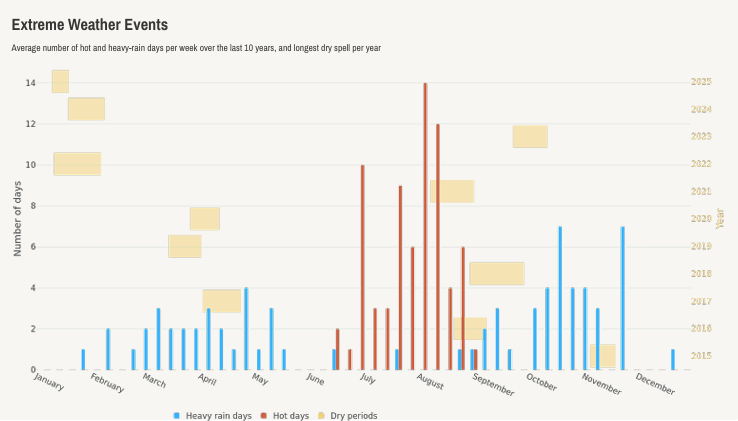
This chart shows the distribution of extreme weather events over the past 10 years.
The number of hot days and heavy rain days (in days) are displayed on the left y-axis.
The duration of drought periods (in days) is displayed on the right y-axis, using the same color as the drought bars.
Each bar represents the sum of daily events per week number across all 10 years (2015–2025).
How to read it:
The x-axis represents the week of the year (1–52).
Taller bars indicate weeks with frequent extreme events.
This visualization helps identify seasonal patterns — for example, dry summers or late-winter heavy rains.
Why this chart matters: It reveals when and how often extreme weather events occur during the year, providing insights into seasonal vulnerabilities for your area.
Page 2: Climate Projections (2026–2036)
These indicators are based on climate model projections using the SSP3-7.0 scenario, which assumes a continuous increase in greenhouse gas emissions. They estimate how extreme event frequencies could evolve over the next decade.
Key Indicators
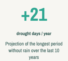
Projected increase in drought days per year for the next 10 years (e.g., 2026–2036), based on the SSP3-7.0 scenario.
What this means:
Represents the expected change compared to the last 10 years.
For example, +21 drought days/year means dry spells will become significantly longer.
Why it matters: Extended droughts can impact water resources, agriculture, and soil stability, and are a key early sign of climate stress.
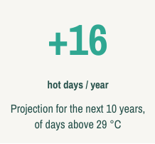
Projected increase in hot days per year, using the same local temperature threshold as defined in the previous page.
What this means:
For example, +16 hot days/year indicates a strong rise in the number of days above the local heat threshold.
Using the same threshold allows for consistent temporal comparison.
Why it matters: Highlights the intensification of heat events and potential impacts on health, infrastructure, and energy demand.
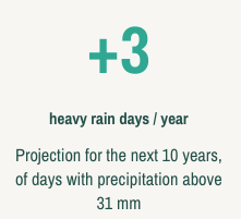
Projected increase in heavy rain days per year based on local rainfall thresholds.
What this means:
For example, +3 heavy rain days/year means extreme rainfall events will become slightly more frequent.
Calculated using the same percentile-based method as for past observations.
Projections of Extreme Weather Events Chart
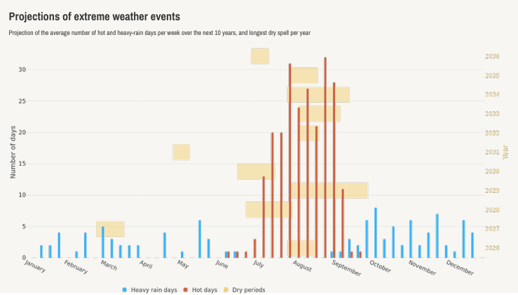
This chart illustrates projected extreme events for the next 10 years (2026–2036).
How to read it:
Hot-day and heavy-rain counts (days) are shown on the left y-axis.
Drought periods (per year) appear on the right y-axis, with the same color for consistency.
The x-axis displays weeks of the year, based on the modeled projections.
Patterns to notice:
Increasing bar heights in warm months indicate longer or more frequent heat and drought events.
Rising blue bars during certain weeks may show intensified rainfall episodes.
These patterns highlight the seasonal and cumulative evolution of climate risks at your location.