User Interface
The FloodCast web dashboard is accessible at https://floodcast.hpc.cineca.it/. No authentication is currently required. It provides two main views corresponding to the two product types.
Streamflow View
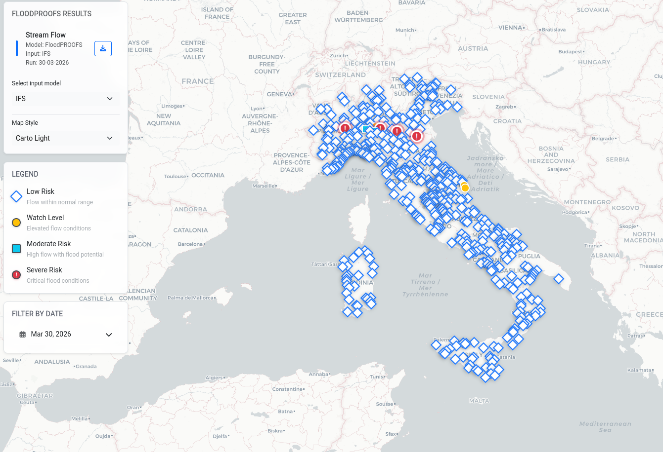
The streamflow view displays all FloodPROOFS river sections on an interactive map.
Marker Appearance
Each section is represented by a marker whose shape and colour indicate the current risk level:
Low Risk — flow within normal range
Watch Level — elevated flow conditions (threshold Level 1 exceeded)
Moderate Risk — high flow with flood potential (threshold Level 2 exceeded)
Severe Risk — critical flood conditions (threshold Level 3 exceeded)
Alert thresholds (Level 1, Level 2, Level 3) are collected from local authorities and are defined on a per-station basis. Not all stations are provided with threshold values.
Map Interaction
Users can:
Zoom in/out to explore specific areas
Pan across the map
Click markers to select monitoring stations
Control Panels
The left-hand control panels provide:
Model selection — choose between IFS and ICON (when available for the selected date)
Map style — Carto Light, Satellite Hybrid, Dark Terrain
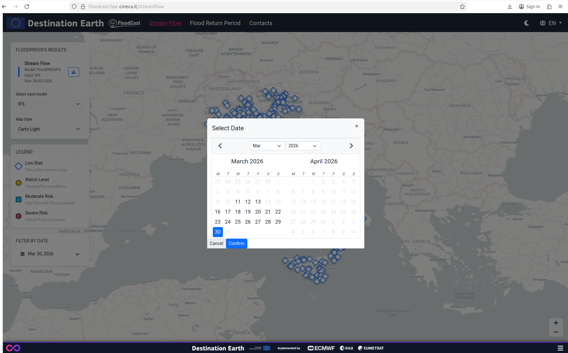
Date selector — calendar widget where bold dates indicate FloodPROOFS output is available, greyed-out dates indicate no data, and the most recent forecast is shown by default
Download — button to download the NetCDF streamflow file for the selected model and date
Legend — marker shape and colour indicate risk level
Time Series Plot
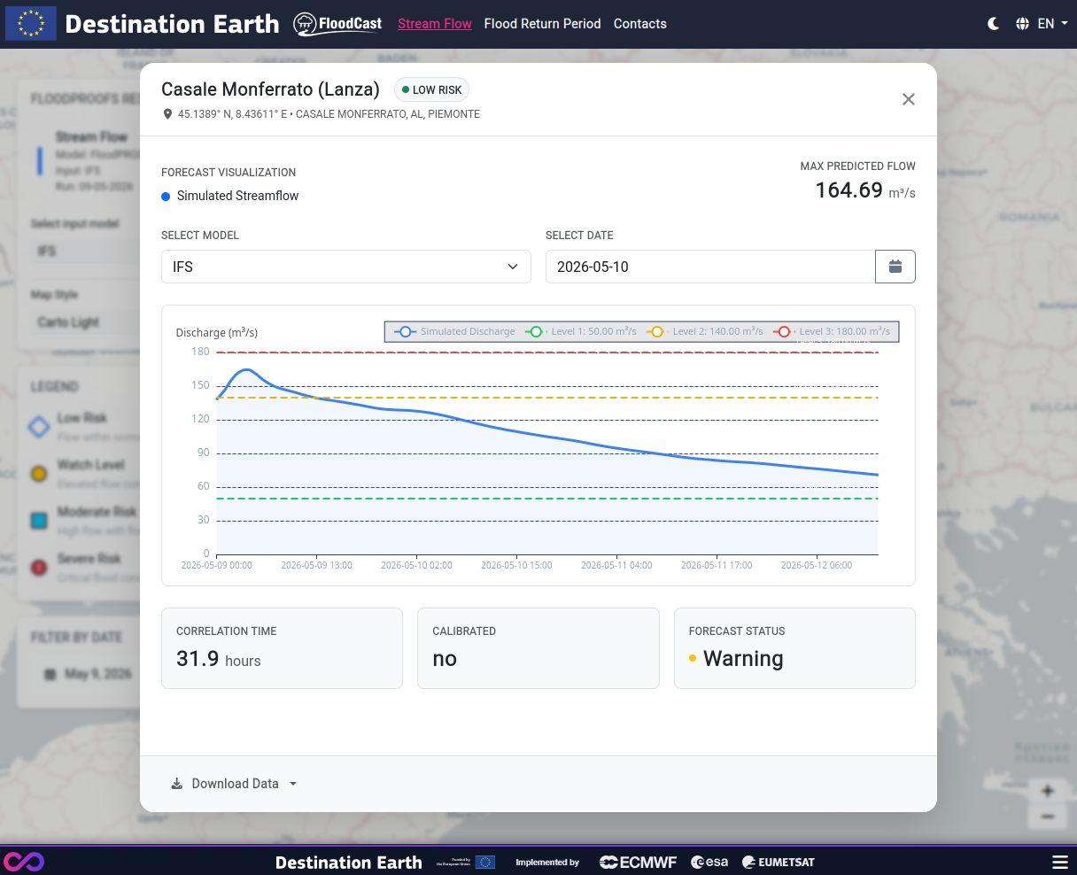
Clicking a station marker opens a detail panel displaying:
Chart: simulated discharge (m³/s) over the forecast period (hours), with alert-threshold levels (Level 1, 2, 3) as horizontal dashed lines where available
Header: station name, risk level badge, geographic coordinates, municipality, province, region
Max predicted flow: the peak discharge value over the forecast window
Model/date controls: switch model or date within the panel
Key indicators:
Correlation time (hours)
Calibration status (yes/no)
Forecast status (Low Risk, Watch, Moderate Risk, Severe Risk)
Download options: CSV, JSON, or original NetCDF
Download Options
From the dashboard, users can download:
Streamflow data:
NetCDF file — full forecast output for all ~500 stations for the selected model and date (via the download icon in the left panel)
CSV — time series for a single station (from the station detail panel)
JSON — time series for a single station (from the station detail panel)
Return Period data:
GeoTIFF — the original single-band raster for the selected model and date, suitable for import into GIS software
Return Period View
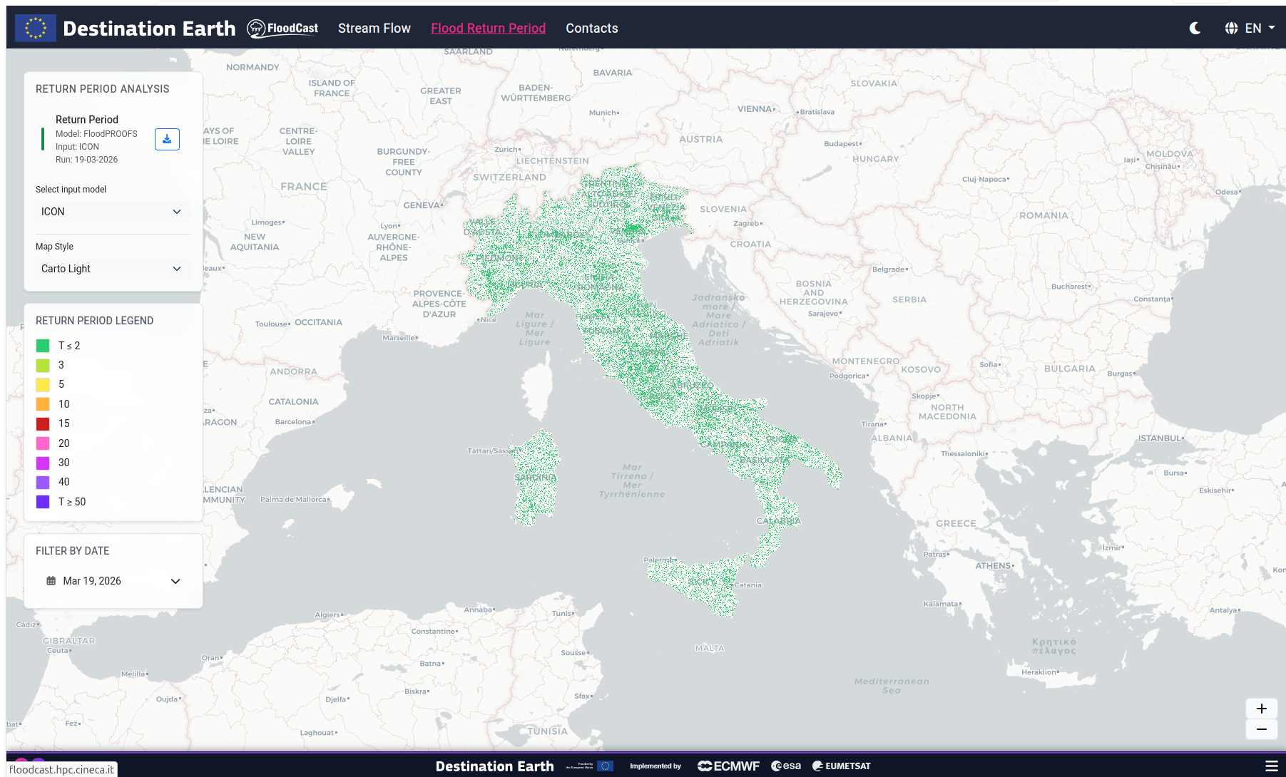
The return-period view displays the maximum flood return period within the forecast window for each pixel of the Italian river network.
Map Display
The map is colour-coded with return-period classes:
T ≥ 2 years (green)
T ≥ 5 years
T ≥ 10 years
T ≥ 20 years
T ≥ 50 years (dark purple)
Control Panels
Model selection — IFS or ICON
Date selector — same calendar behaviour as the streamflow view
Map style — Carto Light, Satellite Hybrid, Dark Terrain
Download — original single-band GeoTIFF file
Legend — colour scale for return-period classes