Layers are the actual containers of the 3D representation of data. Due to their nature, they are the core feature of Vision.
They can be added or removed through the Layer sub-menu, in the top Menu Bar. When a layer is added and selected, the UI is fully displayed in all of its main parts.
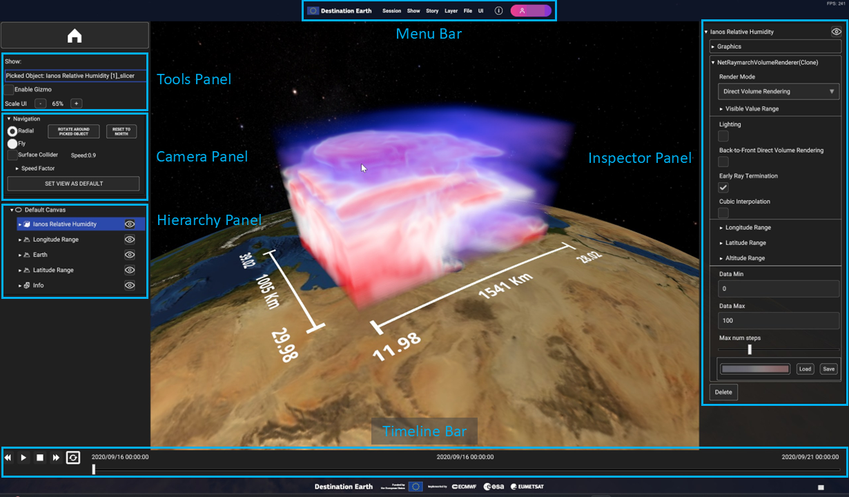
Fig. 4.1 [UPDATE] UI Panels: Menu Bar (top), Tools Panel, Camera Panel, Hierarchy Panel (left), Timeline (bottom), Inspector Panel (right)
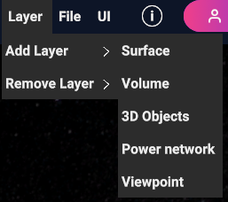
If you wish to add a Layer to the current Show, click on the Layer > Add Layer, to see the list of all available layer types.
Fig. 4.2 Add layer, with the list of available layer types
Here are the available Layer types:
Surface Layer
A surface Layer contains data in the form of 2D images. It is capable of blending up to five geo-referenced surface data onto a single geometry. These data can originate from various sources, WMS, videos, or images sourced either locally or from the internet.
Check Chapter “Canvases, Layers and Data Sources” > “Layers” > “Surface Layer” for more details.
Volume Layer
A Volume Layer is designed to render geo-referenced 3D volume data sourced from local device storage.
See Chapter “Canvases, Layers and Data Sources” > “Layers” > “Volume Layer” for more details.
3D Objects Layer
A 3D Objects Layer is equipped to render geo-referenced 3D models, images, labels, and overlay images or labels.
See Chapter “Canvases, Layers and Data Sources” > “Layers” > “Objects Layer” for more details.
Power Network Layer
The Power Network Layer is capable of rendering geo-referenced histograms and charts derived from a collection of CSV (Comma-Separated Values) files stored locally on the device. These files typically contain data related to energy production and demand.
See Chapter “Canvases, Layers and Data Sources” > “Layers” > “Power Network Layer” for more details.
Viewpoint Layer
The Viewpoint Layer can be populated with single points in the space to fix the camera position and rotation at a certain instant.
See Chapter “Canvases, Layers and Data Sources” > “Layers” > “Viewpoint Layer” for more details.
The Geometry of a Layer is constructed depending on the type of Canvas (Planar or Ellipsoidal).
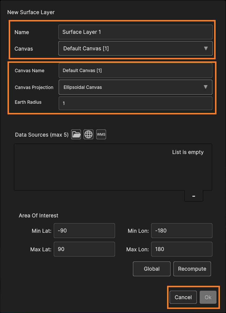
Selecting the layer type to add, a popup window opens to set the layer parameters and the data source to create it.
This window may differ depending on the layer type, but some settings are in common, including the Layer name and the Canvas to which the Layer is added.
Fig. 4.3 Common Layer elements found in any popup window (i.e. Surface Layer)
You can select an existing Canvas or create a new one using the dropdown list.
More details about Canvases, Layers and Data Sources are described in Chapter “Canvases, Layers and Data Sources”.
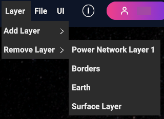
You can remove a Layer with Remove Layer option from the Layer sub-menu.
The options shows the list of all existing Layers within the current Show (therefore it matches the list in the Hierarchy Panel). Selecting one deletes it.
Fig. 4.4 Remove Layer, with the list of existing layers in the scene
As mentioned previously (Chapter “User Interface Overview” > “In App UI”), some UI sections are fully explorable when the scene is populated with objects, layers in particular.
After adding and selecting layers, i’s possible to see the effects on the hierarchy, inspector and timeline panels. This paragraph covers more in detail the feature that can be found in this UI.
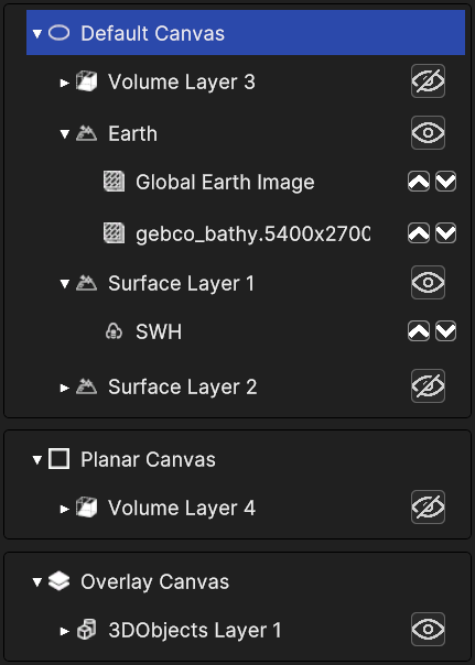
The Hierarchy Panel provides a visual representation of the composition of the 3D scene, displaying nested trees of Canvases, Layers, and Data Sources.
A Canvas may contain multiple Layers, while each Layer may consist of several Data Sources.
It’s designed to show the user a clear overview of the different elements and how they are organized. Each item in the hierarchy has an icon for its type (e.g., camera, overlay, object layer).
Any item with nested elements can be expanded to show its children. If it’s a layer, you can use the arrows to move up or down the data sources within it and change their order, affecting the rending order in 3D.
Layers can be shown or hidden with the eye icon. Selecting an item displays its information in the Inspector Panel.
The Inspector Panel shows the properties of the currently selected element in the Hierarchy Panel. Each property can be edited to affect the behaviour and appearance of the object in the 3D view.
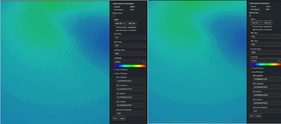
Fig. 4.6 Inspector Panel UI example (Daniel SWH data source)
This panel displays information of any kind of 3D object in the scene, whether it’s a canvas, a layer or a data source.
Each object type holds different properties, so the information visible in the inspector may vary according to the object selected. Moreover, different layers and data sources display different information on the inspector.
In this section we will showcase the recurring components of this panel, while the specific features of each layer and data source type, and their effect on the inspector panel, will be covered in detail in chapter “Canvases, Layer and Data Sources”.
The inspector panel it’s a collapsible element, where the information is labelled with the name of the selected object. Those are the most common information visible in the panel for each object type :
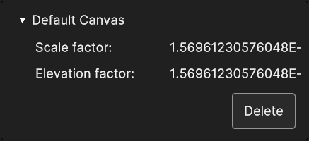
Canvases hold little information, consisting in the scale and elevation factors, and it’s the same for each canvas type. A canvas can be deleted with the button below.
Fig. 4.7 Inspector panel for a canvas (Default Canvas)
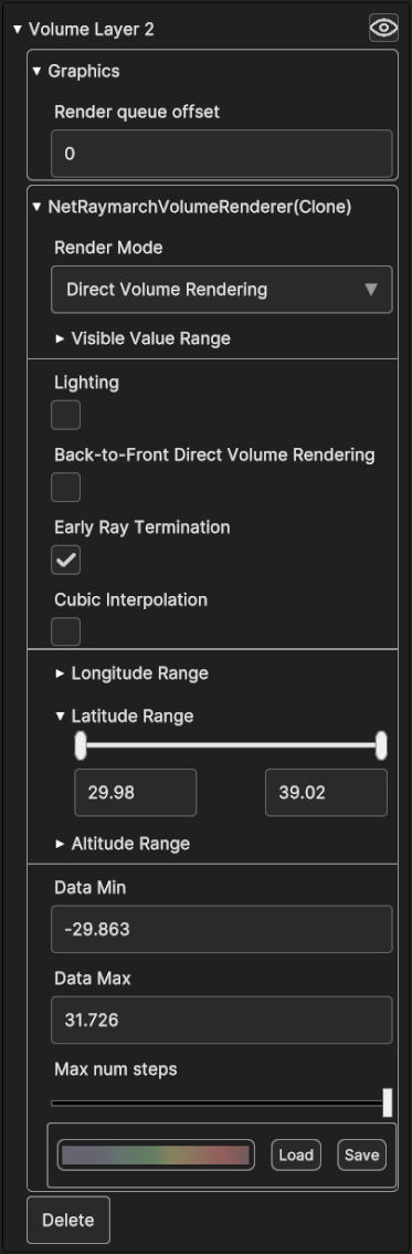
Layers store several information and settings, and often includes a section with graphic settings, a section with geographical settings to change the longitude, latitude and altitude limit to cap when rendering. On the top right corner their inspector shows the same eye icon in the hierarchy panel, which works in the same way. As canvas inspector, they provide a “Delete” button down the data.
Layer inspector may include a tool to change the colors of the 3D representation of the data, the Colormap Picker (check next sub-paragraph “Colormap Picker”).
If a layer holds multiple data sources, colormap picker is usually absent because each data source can have its own colormap, therefore the colormap picker is inside its inspector. In this scenario, the inspector may show a small info collapsible sub-panel for each data source.
Fig. 4.8 Inspector panel of a layer, with graphics settings,
geographical setting and a colormap picker
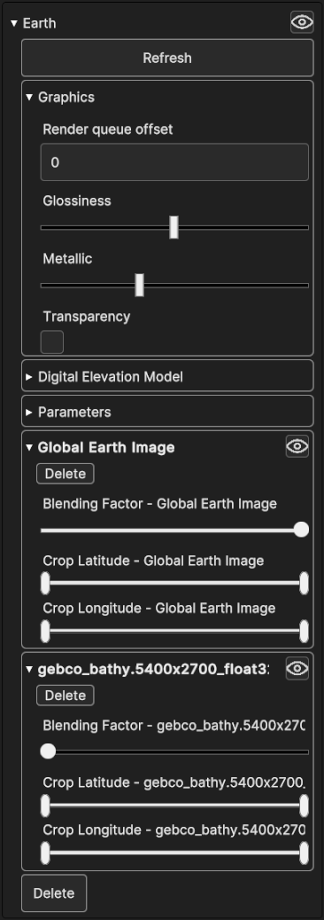
Fig. 4.9 Inspector panel of the Earth layer with graphics and other settings,
plus sub-panels containing settings for the nested data sources
Data source sub-panels contain a few settings that can be made directly from the parent layer, including deleting the data source or hiding it with the specific buttons. It’s possible to set the geographical range by cropping the coordinates with the sliders, and set the blending factor, which affects the opacity of the rendering of the data source.
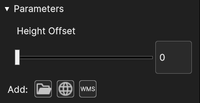
Additionally, the parameter section may contain a small menu to add a data source, which looks and works like the one found inside the add-layer pop up panel for some data types (e.g. surface).
Fig. 4.10 Parameters section with Height Offset settings and the add layer mini menu
Data sources store many other specific information as well as information related to their parent layer, plus many settings.
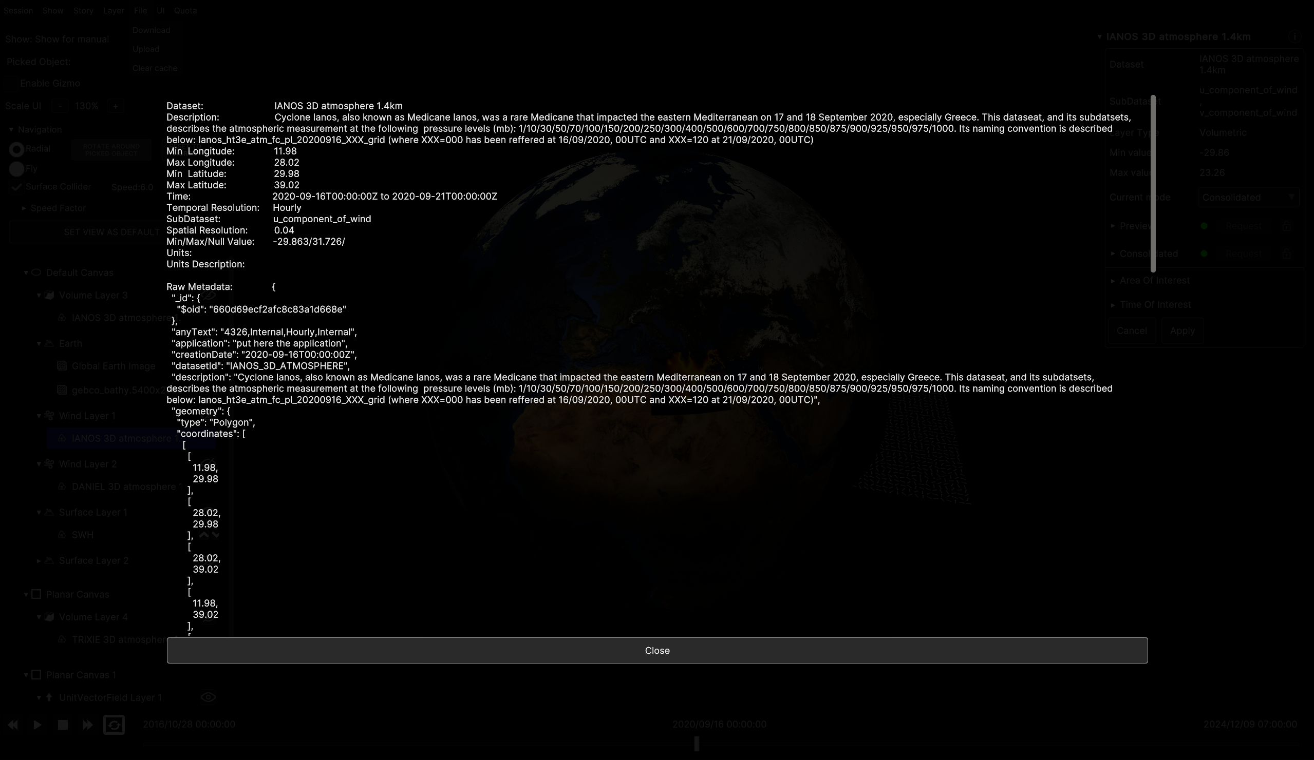
The info button on the corner shows the raw data of the data source as a Json text.
Fig. 4.11 Collapsed inspector panel of a data source with name and info button
Depending on the data type, information displayed in the inspector may vary.
This section contains
o Dataset and Sub dataset name
o Layer Type
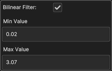
o Min and Max values
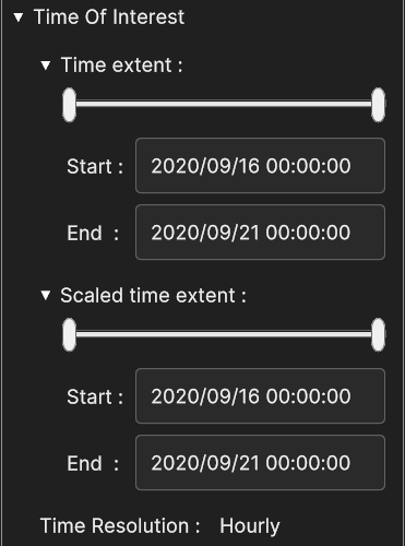
o Area of Interest (AOI) and Time of Interest (TOI) to set the coordinate range and the time range.
o Cancel button to undo the changes made in AOI and TOI and reset to the previously saved ones (since changes do not occur in real time but they need to be manually applied).
o Apply button to confirm any changes made in AOI and TOI.
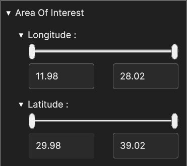
Area of Interest provides sliders to crop longitude and latitude of the data in 3D view. Area Of Interest can be changed only for data sources attached to a surface layer.
Time Of Interest provides sliders to set the Time Extent and Scaled Time Extent and the Time Resolution. Time resolution is the time step. For instance, if the it’s hourly, the data are covered hour by hour.
Time Extent is the time range for that data source and Scaled Time Extent fits the selected Time Range inside the selected scaled range.
The start and end timestamps always match Time Resolution.Time Extent can be edited only for data sources attached to a surface layers.
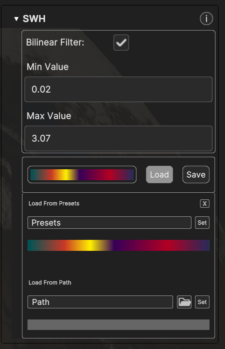
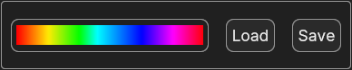
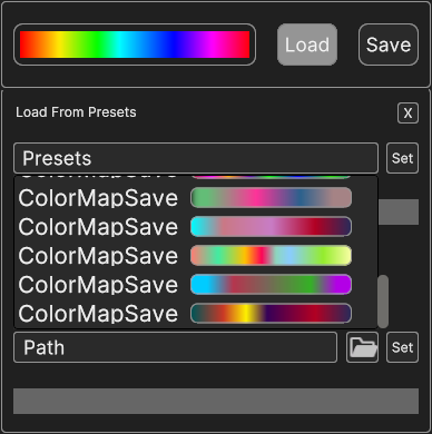
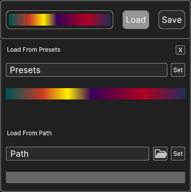
To expand the widget, click on Load button to show loading options. You can choose predefined colormaps from the presets, and click on “set” to confirm it for the selected data.
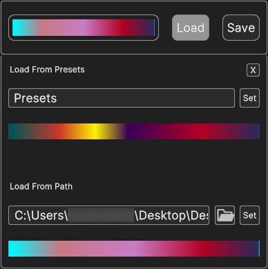
Alternatively you can load colormaps by browsing files locally, with folder button. The path of the selected colormaps is visible in the text box.
Notice that colormaps must be formatted as JSON files. In the same way of the presets, the set button on the label side confirms the selection.
Fig. 4.20 Colormap picker after confirming browsing selection
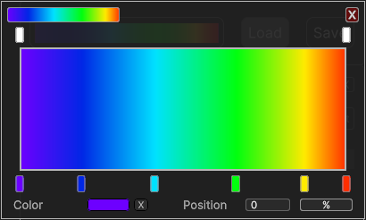
For more customization, you can click on the colormap preview and open the Gradient Picker, to make the gradient by setting specifics color keys and alpha keys.
Gradient picker appears above the Colormap Picked and is explained in the next paragraph. The chosen colormap can be saved in a local directory for future uses with the corresponding button.
Gradient Picker is a nested inside the Colormap Picker. It’s equipped with two multi-sliders to change the color keys and the alpha keys (opacity) of a gradient.
The displayed gradient is the result of the transition between the values of one key to the other. Transparency and color can be changed independently.
Gradient can be adjusted by changing handles positions, and gradient keys can be freely added or removed (maximum 8). To add a handle, just click on the empty space of the slider at the desired position.
The new value is automatically interpolated. To delete a key, first click its handle and then in the bottom part click on the “X” button to remove it.
Fig. 4.22 Gradient Picker after adding alpha handle
Fig. 4.23 Gradient Picker after adding color handle
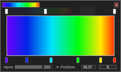
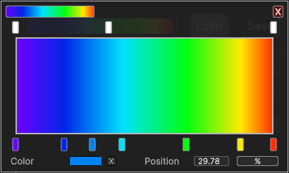
The bottom area shows other properties of the selected keys as well. You can change the opacity or the color (depending on the key type) and the position.
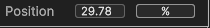
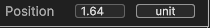
You can directly set the exact position of a key with the textbox, for more precision. The position can be expressed as a 0% - 100% value relative to the gradient interval,
or within the range of the original values of the of the dataset. You can switch between the two display options with the unit button.
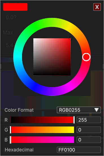
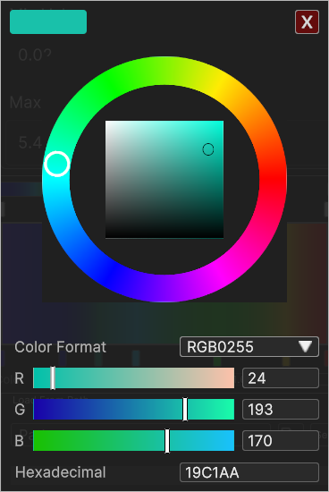
For color keys, a small box shows the color. The color of the key can be changed by clicking on the box, opening up another UI widget, the Color Picker.
The wheel slider allows to change the hue (the tone) of the color, by dragging the handle along the ring.
The 2D square slider inside the wheel is to adjust brightness and saturation. Vertical position of the handle affects brightness, while horizontal position affects saturation.
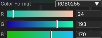
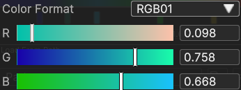
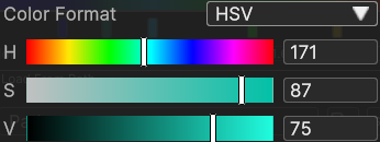
You can change specific components of the color with the channel sliders below. Color can be expressed in different formats:
o RGB 0-255 as a combination of red, green and blue components expressed as an integer value range 0-255
o RGB 0-1 as a combination of red, green and blue components with decimal value range 0.0-1.0
o HSV as a combination of hue, saturation and value channels, ranging from 0 to 360 for the hue (in degrees of the color wheel), and 0 to 100 for saturation and value.
You can switch color format with the dropdown. Sliders are paired with textboxes to set the wished value with precision.
The Timeline Panel is designed as a playback system, to reproduce the evolution of data over time, similarly to audio and video players. You can Play and Pause the reproduction, or Speed Up/Down the playback (when available) with the respective buttons.
The time range in the timeline corresponds to the time range of the original data. The start and end time are above the time bar, and the currently selected instant is in the middle.
You can play it from the start to the end or stop at a specific time for a more detailed analysis. You can also click directly on the timeline or drag the slider to jump to a different instant.