5. Canvases, Layers and Data Sources
A Show is the root of the hierarchy tree of a 3D scene, consisting of Canvases, Layers, and Data Sources, as shown in the following diagram :
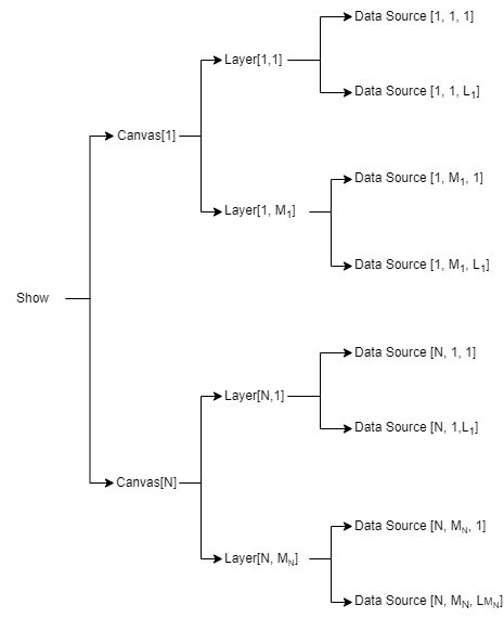
Fig. 5.1 Tree composition of a Show
5.1. Canvases
A special case is the Overlay Canvas, which operates similarly to a Planar Canvas but is always oriented perpendicular to the viewer’s direction. All objects related to the Overlay Canvas are anchored to the viewer’s point of view.
The Overlay Canvas can only be created or selected when the user adds an overlay image or label Data Source to a 3D Objects Layer. It does not apply to other types of Layers and Data Sources.
More details about the Overlay Canvas are described in This chapter > “Layers” > “3D objects layer”.
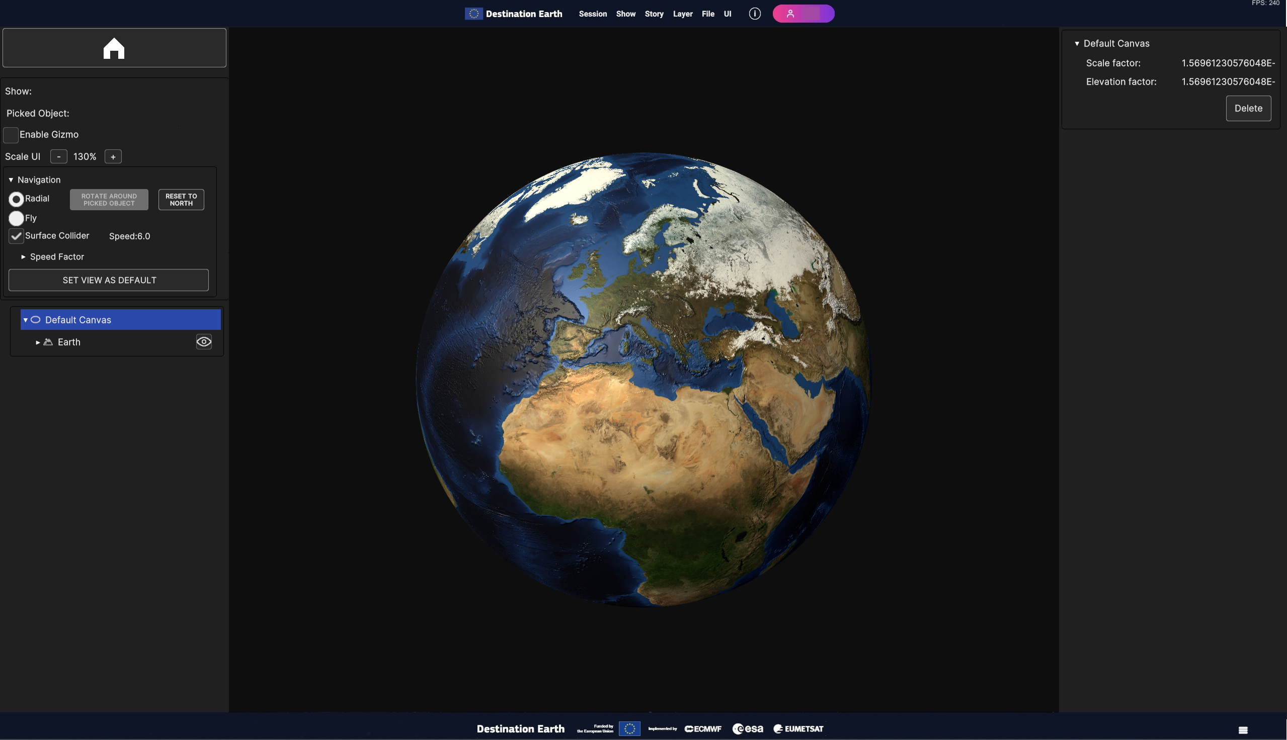
Fig. 5.2 Surface Layer with the static image of the Earth mapped on an Ellipsoidal Canvas (the Default Canvas)
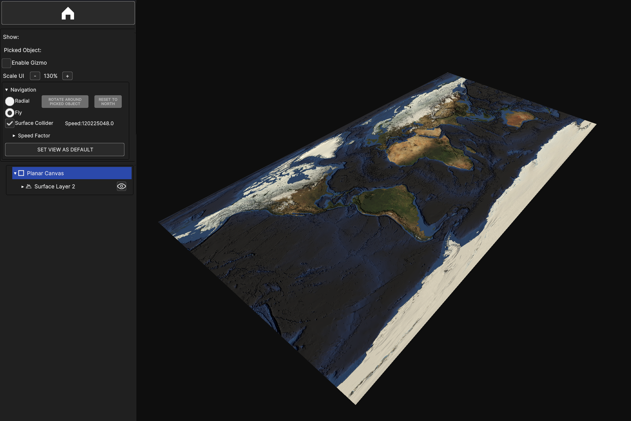
Fig. 5.3 Simple Surface Layer with the static image of the Earth mapped on a Planar Canvas
5.2. Layers
Layers hold the data that are meant to be represented in the 3D view. Every layer is responsible for a specific data type. This sub-chapter provides detailed information about each the layer type.
5.2.1. Surface Layer
5.2.1.1. Add Surface Layer
To add a Surface Layer to the current Show, choose Layer > Add Layer > Surface option from the Menu Bar.
Fig. 5.4 How to add a Surface Layer
A modal window opens to configure the Surface Layer to create and set its Data Sources.
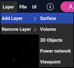
Fig. 5.5 Modal window to add and configure a Surface Layer
User can select the name of the Surface Layer to be added and specify which Canvas add it to, as explained in 3.1 Add Layer Sub-Menu. Additionally, user can manually specify the bounding box of an Area of Interest (AOI) through the Min/Max Lat/Lon edit text fields. | Two shortcut buttons are provided:
The Global button sets the AOI to the global extent of the Earth when pressed
The Recompute button sets the AOI to the union of the bounding boxes of all the Data Sources added to the Surface Layer when pressed
5.2.1.2. Add Data Sources to Surface Layer
User can add or remove Data Sources to the list of sources that are going to create the Surface Layer, as in the modal window.
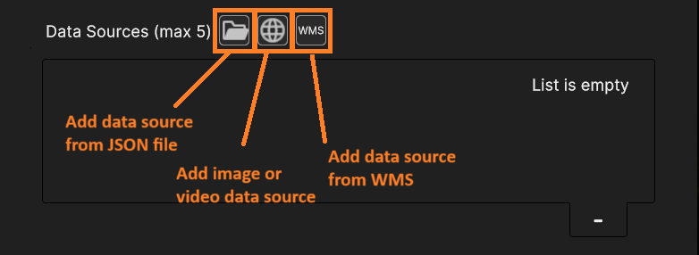
Fig. 5.6 Buttons to add Data Sources
- It is possible to add a surface layer from different data sources (see This chapter > “Data Sources” for more information regarding Data Sources):
Images or videos from local storage or remote URL
From WMS
From JSON local file
To remove an inserted Data Source, select it from the list and press the “-“ button at the bottom right of the list, as shown in the next figure.
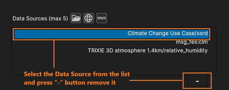
Fig. 5.7 Select the Data Source from the list and press “-“ button remove it
The Surface Layer can blend up to 5 Data Sources. User can confirm the creation of the Surface Layer by pressing the OK button or abort the operation by clicking on the Cancel button.
5.2.1.3. Surface Layer Inspector Panel
When the user selects the Surface Layer by clicking on the respective item in the Hierarchy Panel or by selecting it from the 3D view, the Surface Layer UI card will be displayed in the Inspector Panel.
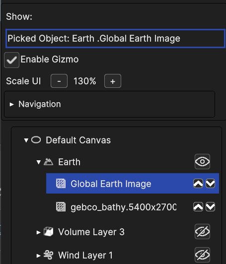
Fig. 5.8 Selection of a Surface Layer in Hierarchy Panel
The Surface Layer UI card is made of a list of collapsible sub-panels, one for each Data Source of the Layer.
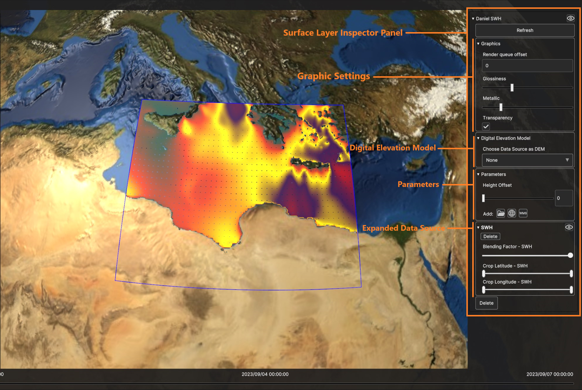
Fig. 5.9 Surface Layer UI card in Inspector Panel
- For each Data Source user can change:
The blending factor: lower value of the slider for Data Source transparency, higher values for Data Source opacity
The crop latitude slider
The crop longitude slider
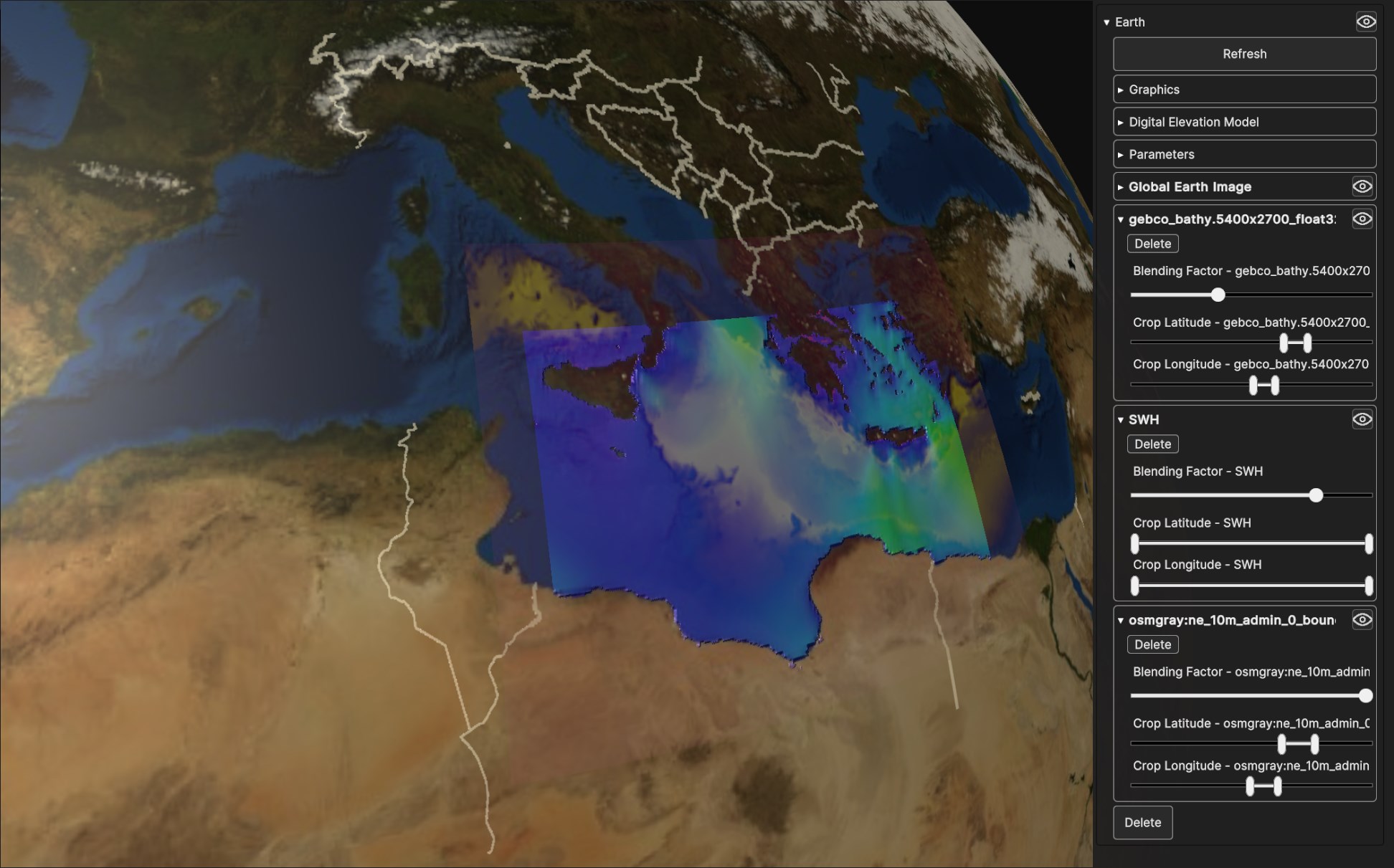
Fig. 5.10 Four blended Data Sources on a Surface Layer Geometry: Global Earth Image, gecho_bathy.5400x2700_float32, Daniel SWH and osmgray:ne_10m_admin_0_boundary_lines_land.png
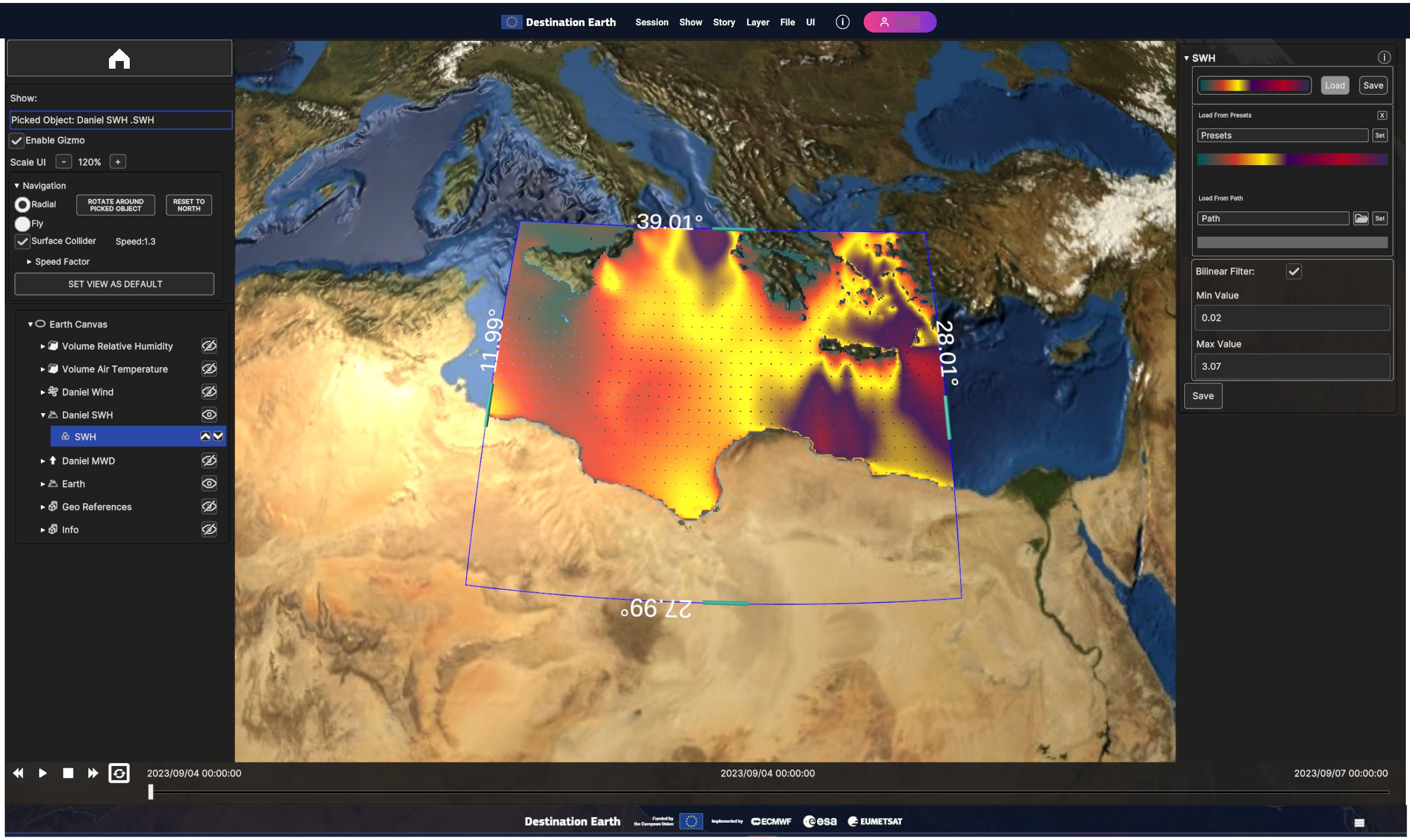
Fig. 5.11 Handles to crop Data Sources of a Surface Layer
Users can select a Data Source to serve as a Digital Elevation Model (DEM), enabling vertex displacement from the surface based on the data value. The DEM dropdown menu displays all available Data Sources. If a Data Source is chosen as a DEM, additional widgets will be revealed in the Surface Layer UI card:
DEM Displacement Factor: to increase/decrease displacement of DEM from the surface
DEM Bump Strength: to increase/decrease bump mapping effect (simulates surface texture by altering lighting based on height information)
DEM Lighting: to enable or disable bump mapping effect
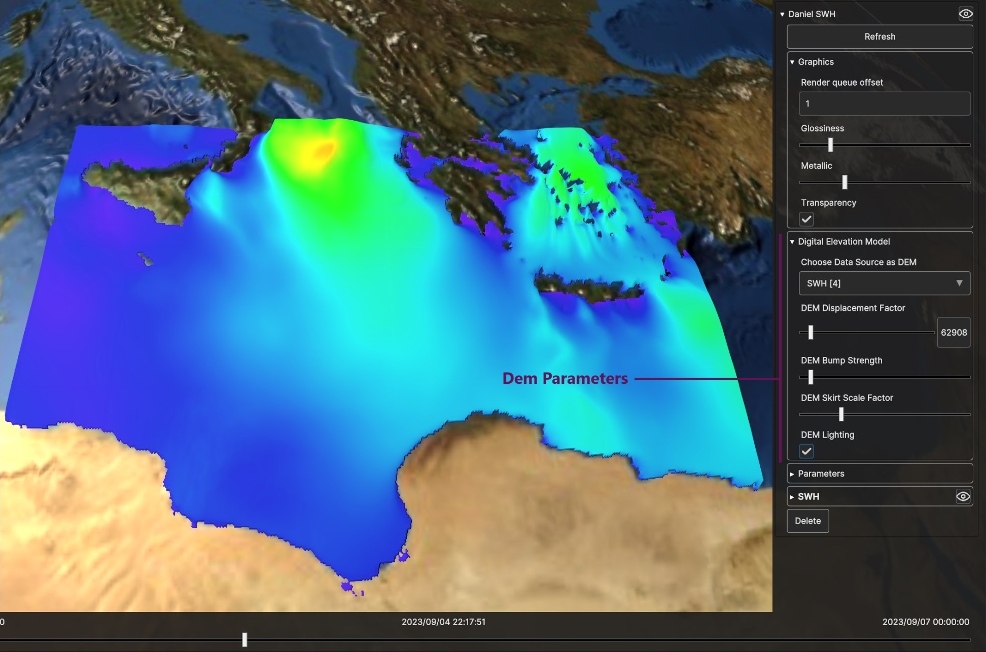
Fig. 5.12 DEM Parameters
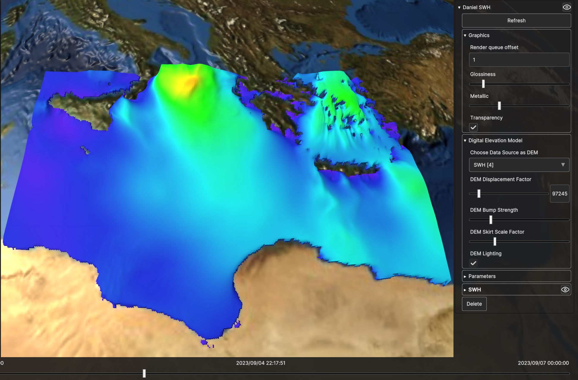
Fig. 5.13 Digital Elevation Model for SWH Data Source, with low bump strength and low displacement
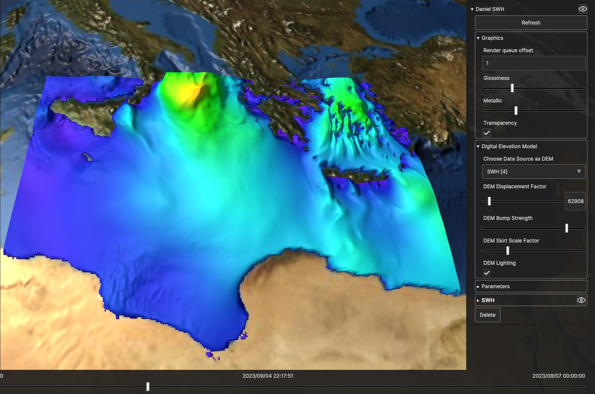
Fig. 5.14 Digital Elevation Model for SWH Data Source, with higher bump strength and low displacement
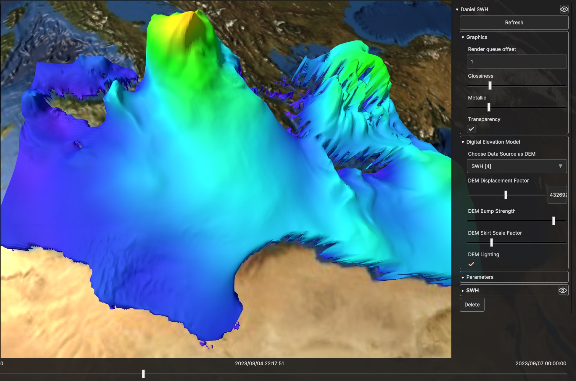
Fig. 5.15 Digital Elevation Model for SWH Data Source, with high bump strength and high displacement
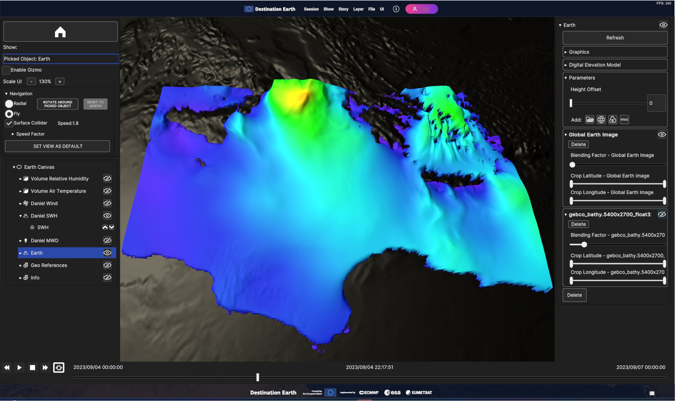
Fig. 5.16 Example of disabled Data Sources and null blending factor: The Global Earth Image Data Source blending factor is set to 0, making it appear as if it were disabled and not rendered.
5.2.2. Volume Layer
Volume layers enable the visualization of variables collected at different pressure levels over a specific geographic area. The data is represented as a three-dimensional cube that can be sliced and filtered to have a better understanding of complex phenomena like storms and hurricanes.
5.2.2.1. Add Volume Layer
To add a volume layer, go to “Add Layer” > “Volume”. Then select a data source from local storage or from an external source. Refer to This Chapter > Data Sources for details.
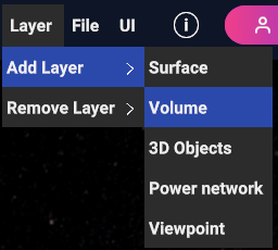
Fig. 5.17 Add volume layer
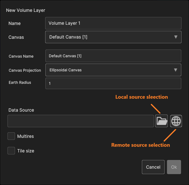
Fig. 5.18 The “volume layer add” dialog
5.2.2.2. Add Data Sources to Volume Layer
5.2.2.3. Volume Layer Inspector Panel UI
Using the timeline, user can navigate the dataset in time. Clicking on the layer card in the hierarchy tree shows the layer settings in the inspecor on the right.
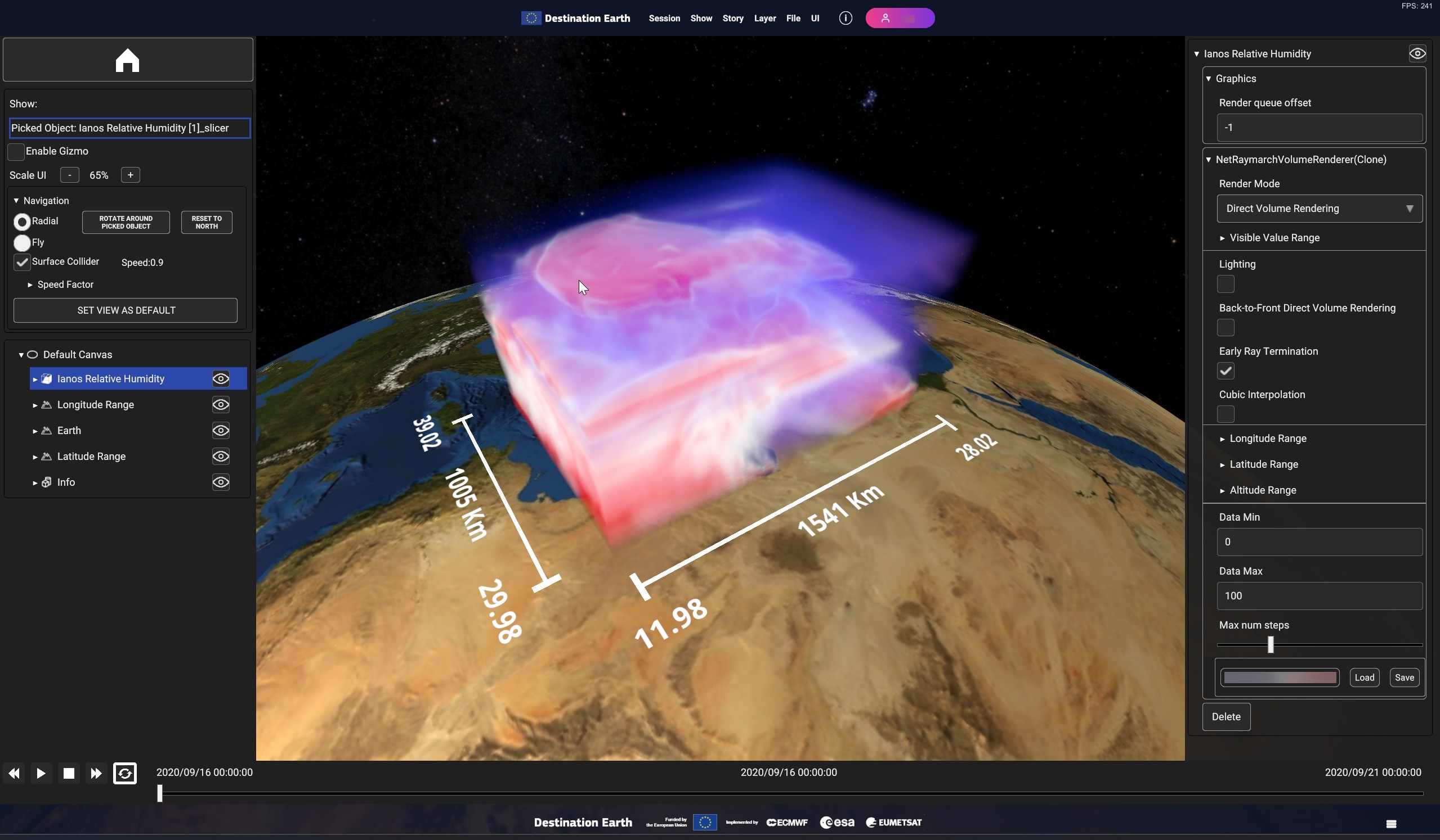
Fig. 5.19 Sample volume layer visualization
- The following settings are available :
Render mode allows to switch between different volume rendering modes. They are all based on the raymarch rendering technique, that computes an intensity value for each pixel, through the combination of the raw values collected by sampling rays originating from the camera position and crossing the volume.
o Direct Volume Rendering (the default option) applies a color map to the final intensity value computed on the previous step.o Maximum intensity projection will draw only the maximum value encountered for each ray, with an opacity proportional to such value.o Isosurface Rendering draw the data as isosurface.Data Min and Data Max allow to define how the dataset raw values are mapped to the output colour scale. That is the “Data Min” is mapped to the colour scale first value, the “Data Max” is mapped to the colour scale last value and all intermediate values are linearly mapped to the other scale colours. All values beyond the limits are discarded. By default, they are initialized to the dataset minimum and maximum values.
Visible Value Range allows to dynamically filter out values (normalized based on the Min/Max values set in the “Data Min” and “Data Max” inputs) outside the define thresholds.
Lighting applies lighting to the volume pixel values. This allows to better highlight the volume iso-surfaces.
Back-to-Front Direct volume Rendering and Early Ray Termination parameters used internally by the ray sampler code. Exposed because changing them can reduce artifacts in some conditions.
Cubic interpolation Improves visualization quality at the expense of rendering performance.
Max num steps sets the number of samples used by the raymarching algorithm. Lower it to improve rendering performance.
Longitude Range, Latitude Range and Altitude Range allow to slice the volume cube by moving the planes orthogonal to the Longitude, Latitude and Altitude dimensions.
The color map, editable with the Colormap Picker.
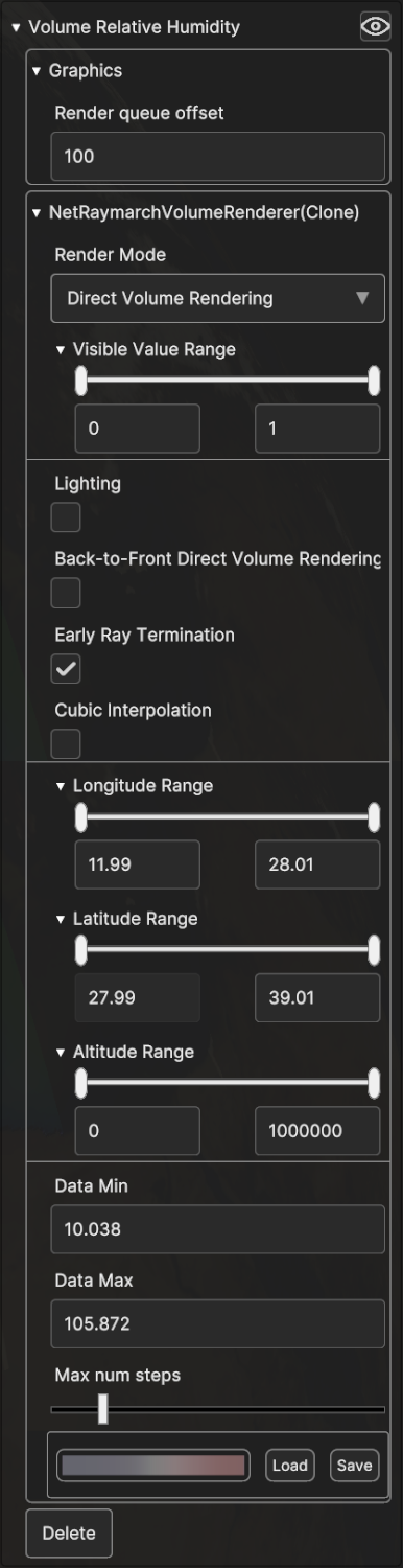
Fig. 5.20 Volume layer visualization settings
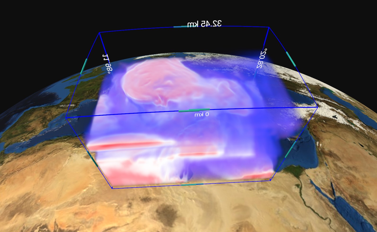
Fig. 5.21 Volume layer slicing
5.2.3. 3D Objects Layer
- A 3D Objects Layer may contain these type of Data Sources:
Georeferenced 3D Model;
Label:
o Georeferenced Label;o Georeferenced Billboard Label;o Label Overlay;Image:
o Georeferenced Image;o Georeferenced Billboard Image;o Image Overlay.
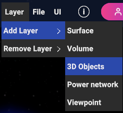
Fig. 5.22 3D Objects Layer menu item
5.2.3.1. Add 3D Objects Layer
If 3D Objects menu item is selected, a popup appear in order to let the user choose the canvas type and the specific 3D Object data source that will be added to the layer.
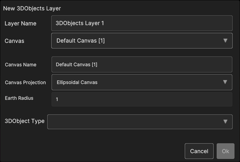
Fig. 5.23 3D Objects Layer popup
- If New Ellipsoidal Canvas or New Planar Canvas is selected, three 3D Object data source types can be created:
Model;
Label (billboard or not)
Image (billboard or not)
- Selecting Model exposes the following parameters:
Name: the name of the 3D model
Load Model from Uri: the 3D model uri
Load Model from File: by clicking on the Folder icon, a popup appear for navigating inside the OS and selecting the 3D model file
Latitude, Longitude, Elevation: the 3D model coordinates
Rotation X, Rotation Y, Rotation Z: the 3D model orientation
Scale X, Scale Y, Scale Z : the scale values
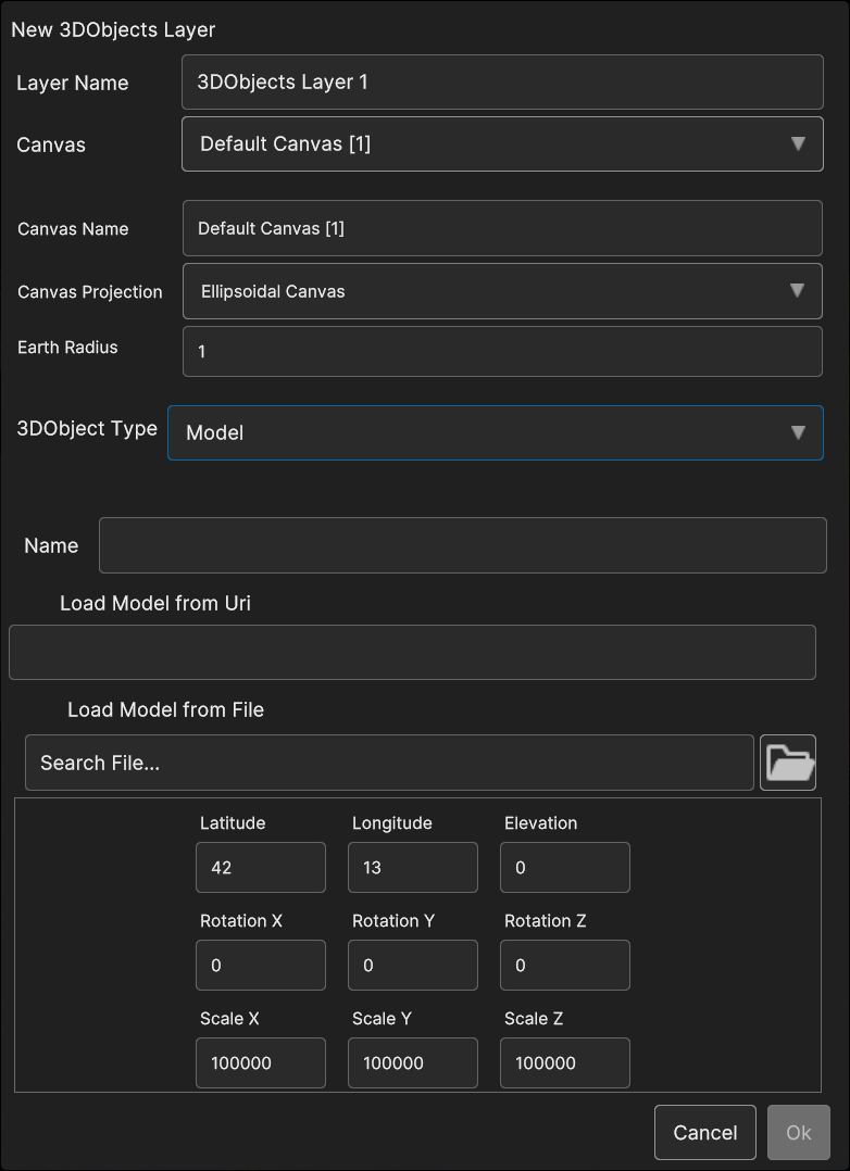
Fig. 5.24 3D Objects Model data source popup
- Selecting Label shows the following parameters:
Label Name: the name of the 3D model
Label Text: the 3D label text
IsBillboard: if the checkbox is checked, the label will behave as a billboard (the label keeps itself oriented towards the camera), otherwise the label orientation will be static
Font Size: the 3D label font size
Wrapping: if the checkbox is checked, the label text will be splitted in one or more lines, otherwise it will be allocated on single line
Latitude, Longitude, Elevation: the 3D model coordinates
Rotation X, Rotation Y, Rotation Z: the 3D model orientation
Scale X, Scale Y, Scale Z : the scale values
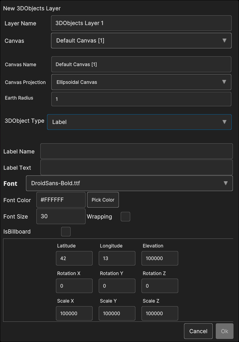
Fig. 5.25 3D Objects Label data source popup
- Selecting Image allows to set the following parameters:
Name: the name of the image
IsBillboard: if the checkbox is checked, the image will become a billboard (the image keeps itself oriented towards the camera), otherwise the image orientation will be static
Uri: by clicking on the Folder icon, a popup appear for navigating inside the OS and select the image file
Latitude, Longitude, Elevation: the 3D model coordinates
Rotation X, Rotation Y, Rotation Z: the 3D model orientation
Scale X, Scale Y, Scale Z : the scale values
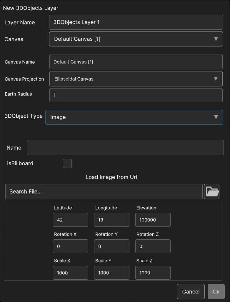
Fig. 5.26 3D Objects Image data source popup
- If in the 3D Objects Layer popup New Overlay Canvas type is selected, two type of 3D Object can be created:
Label Overlay
Image Overlay
- With Label Overlay selected, the following parameters are available :
Label Name: the name of the label overlay data source
Label Text: the label text
Font Size: the label font size
PosX, PosY: the label overlay 2D screen position
PosZ: the label position on the Z axis; the label is inside the 3D scene, so PosZ can be used in order to change the label depth value
Rect Width, Rect Height: the size of the 2D rectangle containing the label
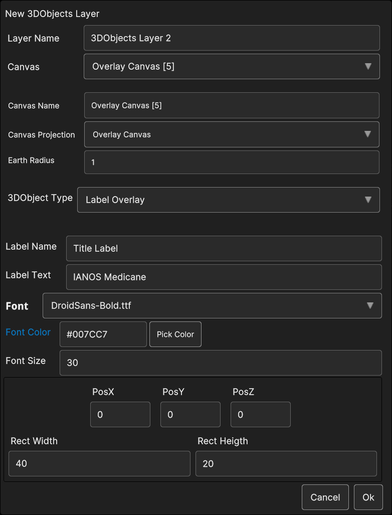
Fig. 5.27 3D Objects Label Overlay data source popup
- If Image Overlay is selected, user is able to set the image following parameters:
Image Name: the name of the image
Load Image from Uri: by clicking on the Folder icon, a popup appear for navigating inside the OS and select the image file
Scale: the scale value
PosX, PosY: the image overlay 2D screen position
PosZ: the image position on the Z axis; the image is inside the 3D scene, so PosZ can be used in order to change the label depth value
Rect Width, Rect Height: the size of the 2D rectangle containing the image
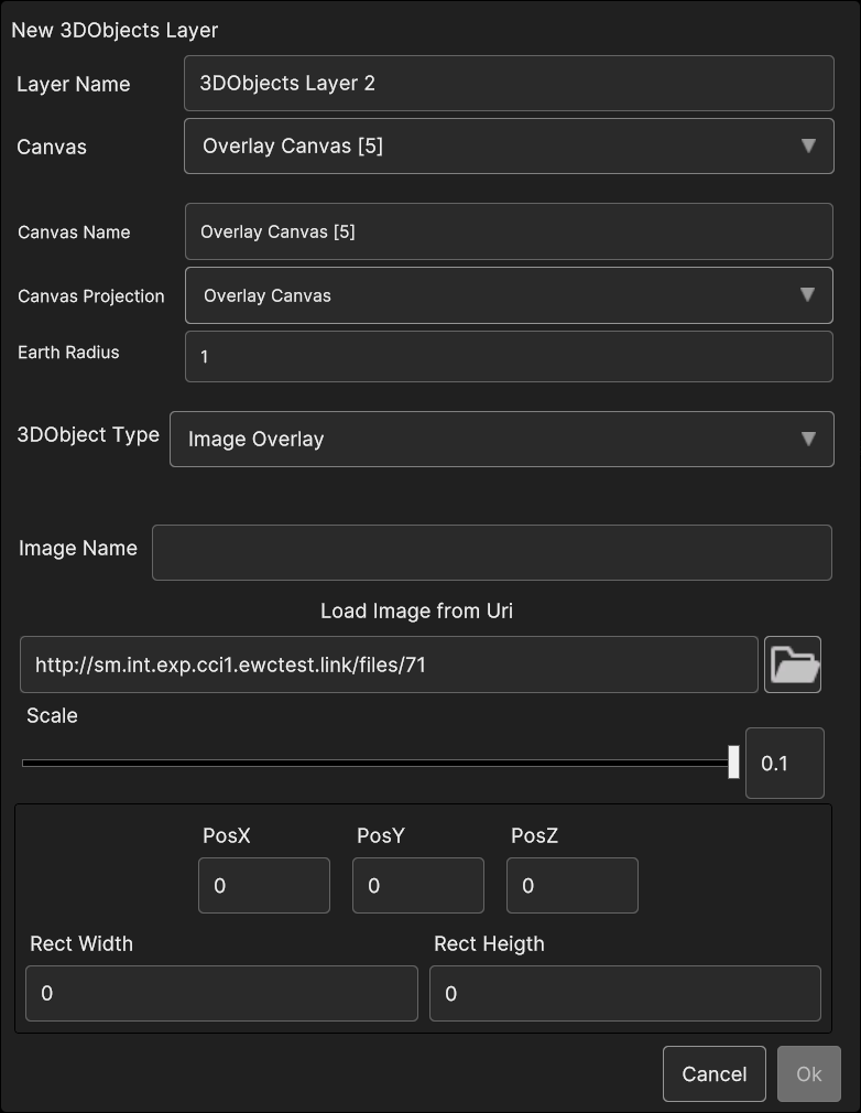
Fig. 5.28 3D Objects Image Overlay data source popup
5.2.3.2. Add Data Sources to 3D Objects Layer
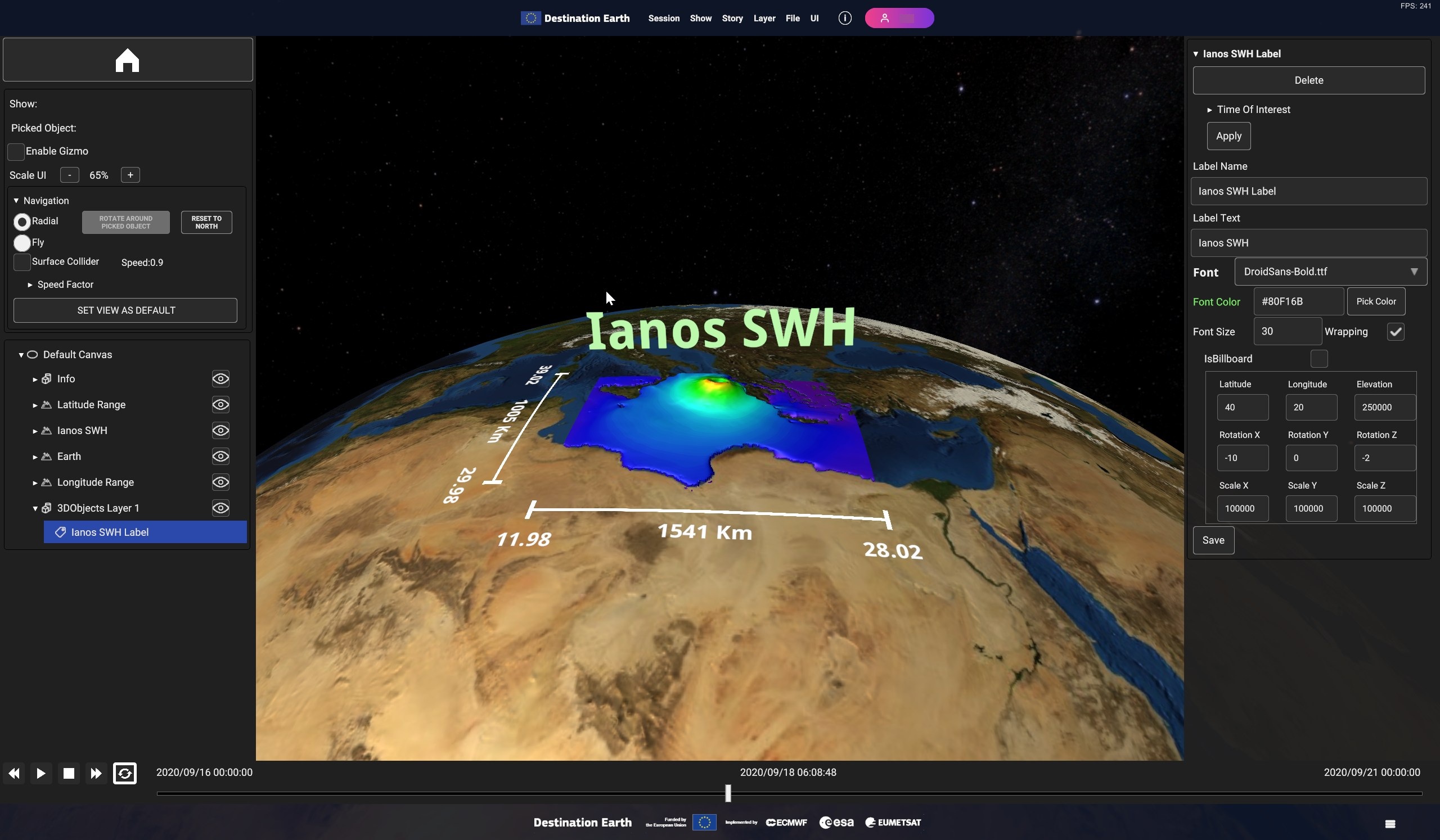
Fig. 5.29 3D Objects Layer Inspector card for add Data Source
- In the popup user can to select the 3D object type, depending on the layer canvas type:
If Layer belongs to an Ellipsoidal Canvas or a Planar Canvas, the options are:
o Modelo Labelo ImageIf Layer belongs to an Overlay Canvas, the options are:
o Label Overlayo Image Overlay
5.2.3.3. 3D Objects Layer Inspector Panel UI
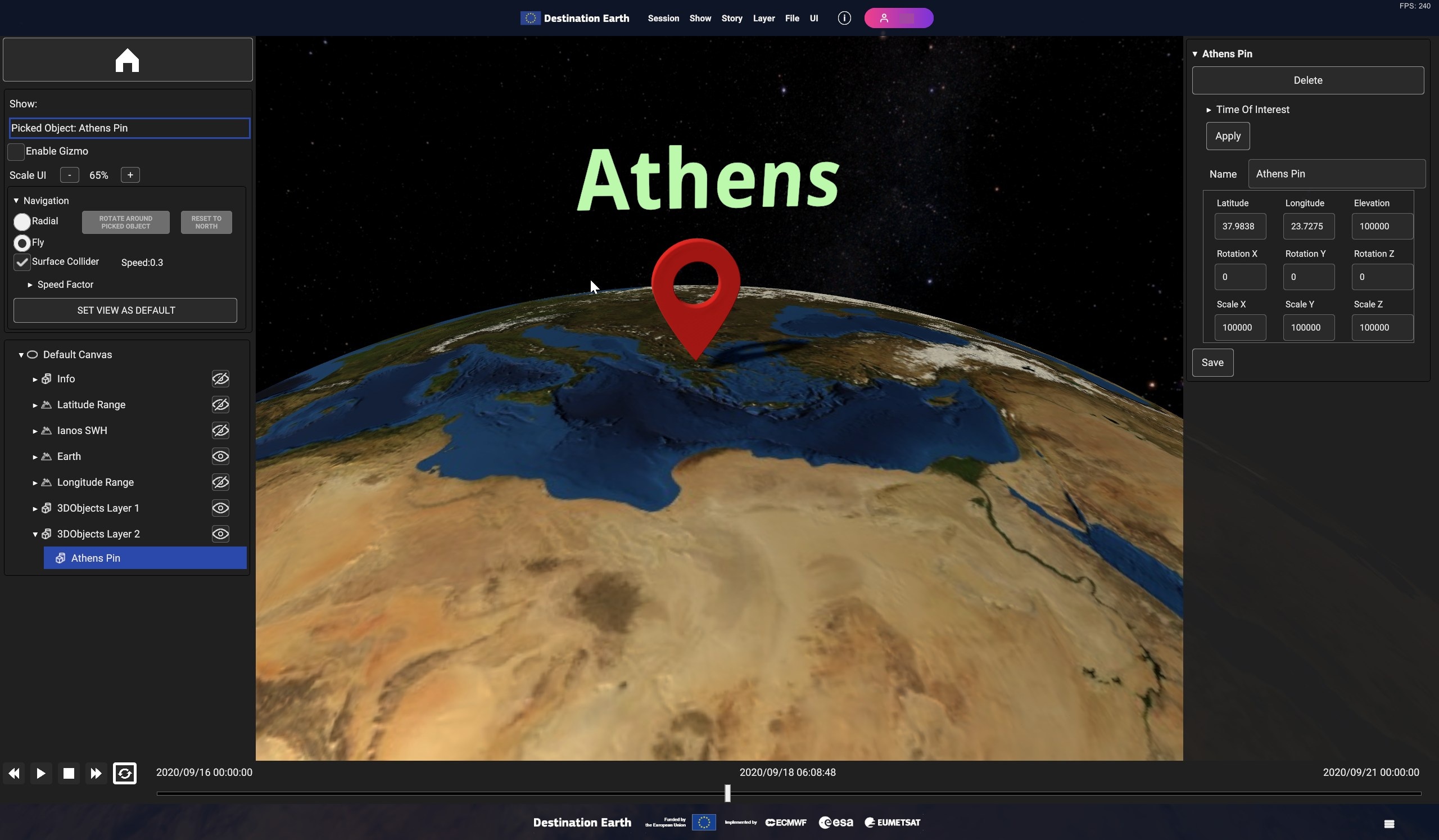
Fig. 5.30 Example of 3D models : Red Pin placed on Athens coordinates with Athens
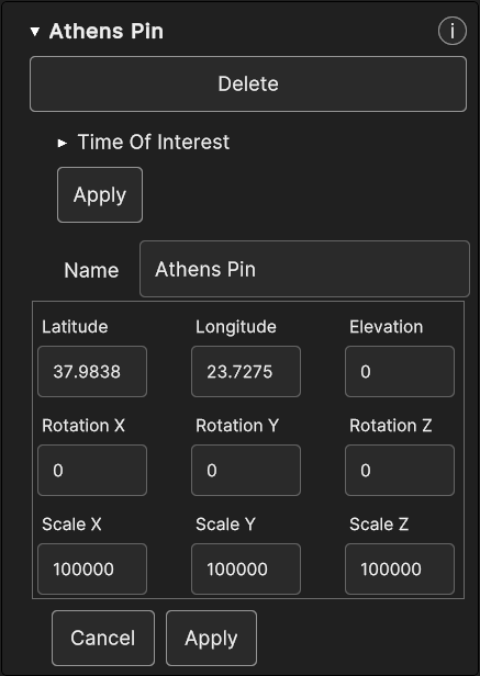
Fig. 5.31 3D Model Inspector Panel
- Label object type displays these properties in the Inspector Panel :
Time Of Interest
Label Name
Label Text
Font
Font Color
Font Size
Wrapping
IsBillboard
Latitude, Longitude, Elevation
RotationX, RotationY, RotationZ
ScaleX, ScaleY, ScaleZ
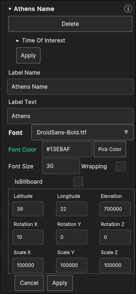
Fig. 5.32 Label Inspector Panel
- Image type data sources holds these parameters in the Inspector Panel, which can be updated at runtime:
IsBillboard checkbox
Latitude, Longitude, Elevation
RotationX, RotationY, RotationZ
ScaleX, ScaleY, ScaleZ
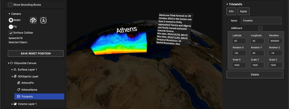
Fig. 5.33 Image Inspector Panel
- By selecting a data source of type Label Overlay (ShowTitle in the Figure below), the Inspector Panel parameters that can be updated at runtime are:
Label Text: the label text
Font Size: the label font size
PosX, PosY: the label overlay 2D screen position
PosZ: the label position on the Z axis; the label is inside the 3D scene, so PosZ can be used in order to change the label depth value
Rect Width, Rect Height: the size of the 2D rectangle containing the label
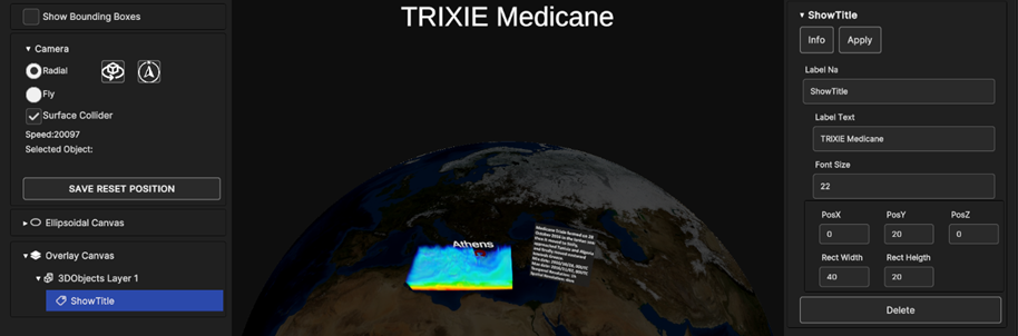
Fig. 5.34 Label Overlay Inspector Panel
- If Image Overlay is selected, the user is able to set the image following parameters:
Scale: the scale value
PosX, PosY: the image overlay 2D screen position
PosZ: the image position on the Z axis; the image is inside the 3D scene, so PosZ can be used in order to change the label depth value
Rect Width, Rect Height: the size of the 2D rectangle containing the image
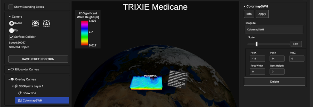
Fig. 5.35 Image Overlay Inspector Panel
In every 3D Object data sources right Inspector Panel card there is a DELETE button: by pressing on it, the data source will be removed from the 3D scene and all its UI card and widget will be removed too.
5.2.4. Power Network Layer
Power network layers are designed to provide 3D visualization of graph data related to power networks, encompassing node production/demand and power flowing between nodes.
5.2.4.1. Add Power Network Layer
To add a power network layer, select “Power network” from the “Add Layer” menu. A popup like the one shown in Figure 4-45 is opened. To proceed the user must select a data source from the local file system. Once the data source it’s selected, the addition can be confirmed with the “Ok” button.
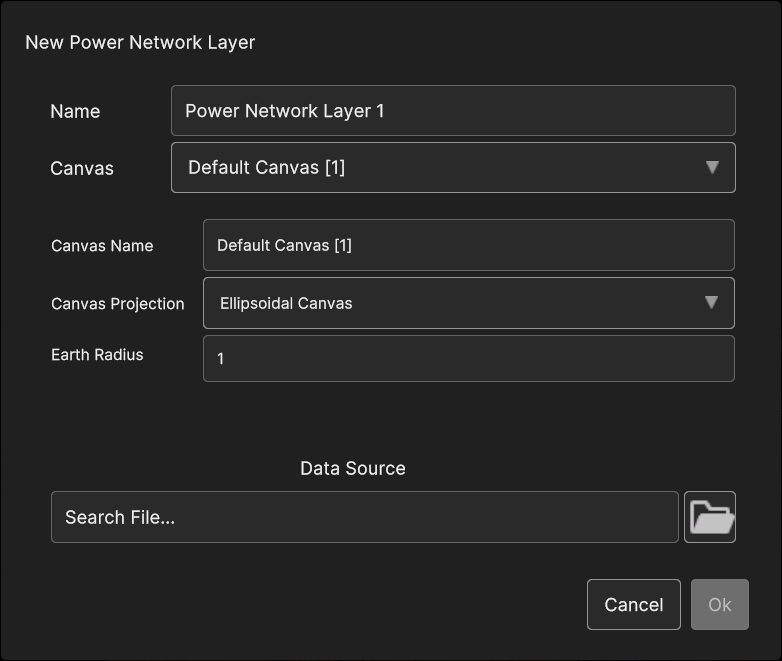
Fig. 5.36 Power network layer add dialog
5.2.4.2. Power Network Layer Inspector Panel UI
A power network layer displays a set of vertical bars for each of the nodes of the network, representing the value of the selected node variables (e.g. wind power generation, power demand etc) for the currently selected timestamp. The links between the nodes are animated and coloured basing on the power flowing between the nodes.
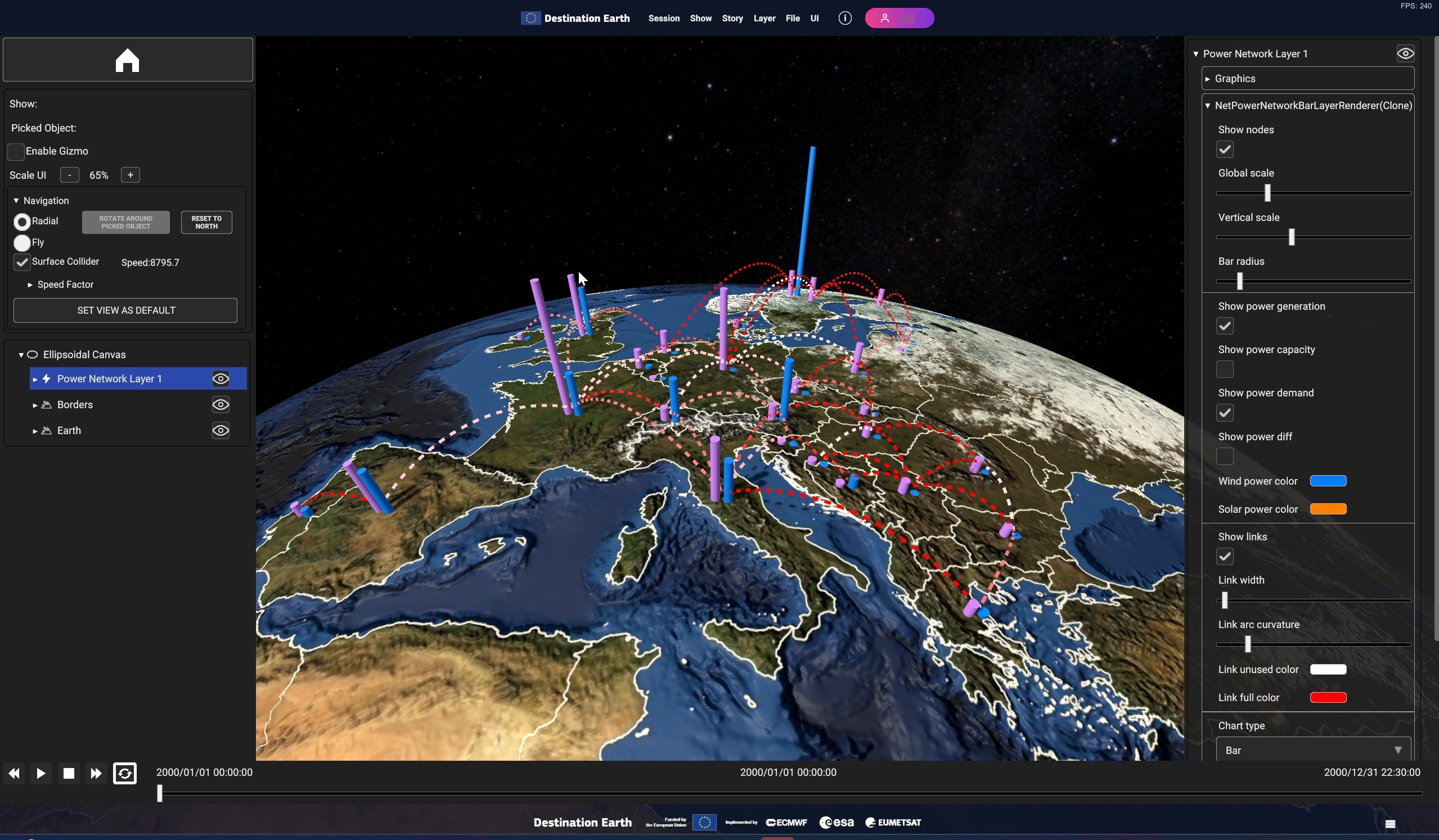
Fig. 5.37 Sample power network layer visualization
To add a power network layer: “Layer” > “Add Layer” > “Power Network”
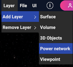
Fig. 5.38 Add power network layer
Clicking on a node opens a panel in 3D space at its side, showing the values of the variables for the selected node at the currently selected timestamp.
Fig. 5.39 Power network node info panel
Fig. 5.40 Power network node time series
- As per other layers, when the network item is selected in the hierarchy tree, the visualization settings panel will appear in the right side of the user interface. The following settings are available to tweak the layer appearance:
- • Vertical scale: Increase/decrease the height scale factor applied to the node bars.• Bar radius: Increase/decrease the radius of the node bars• Link width: Increase/decrease the line width used to display node links• Global scale: A global scale factor that applies to all of the above scale settings• Show nodes, “Show links”: Enable/Disable the visualization of the network nodes/links• Show power generation, Show power demand, Show power capacity, Show power diff: Select the variables to display in the node bars representation.• Chart type: Select the type of chart used for node series visualization. Available options are “Bar chart” and “Line chart”• Chart variable: Select the variable to display in the series chart. Available options are “Production”, “Capacity”, “Demand” and “Difference”
Fig. 5.41 Power network layer settings
5.2.5. Viewpoint Layer
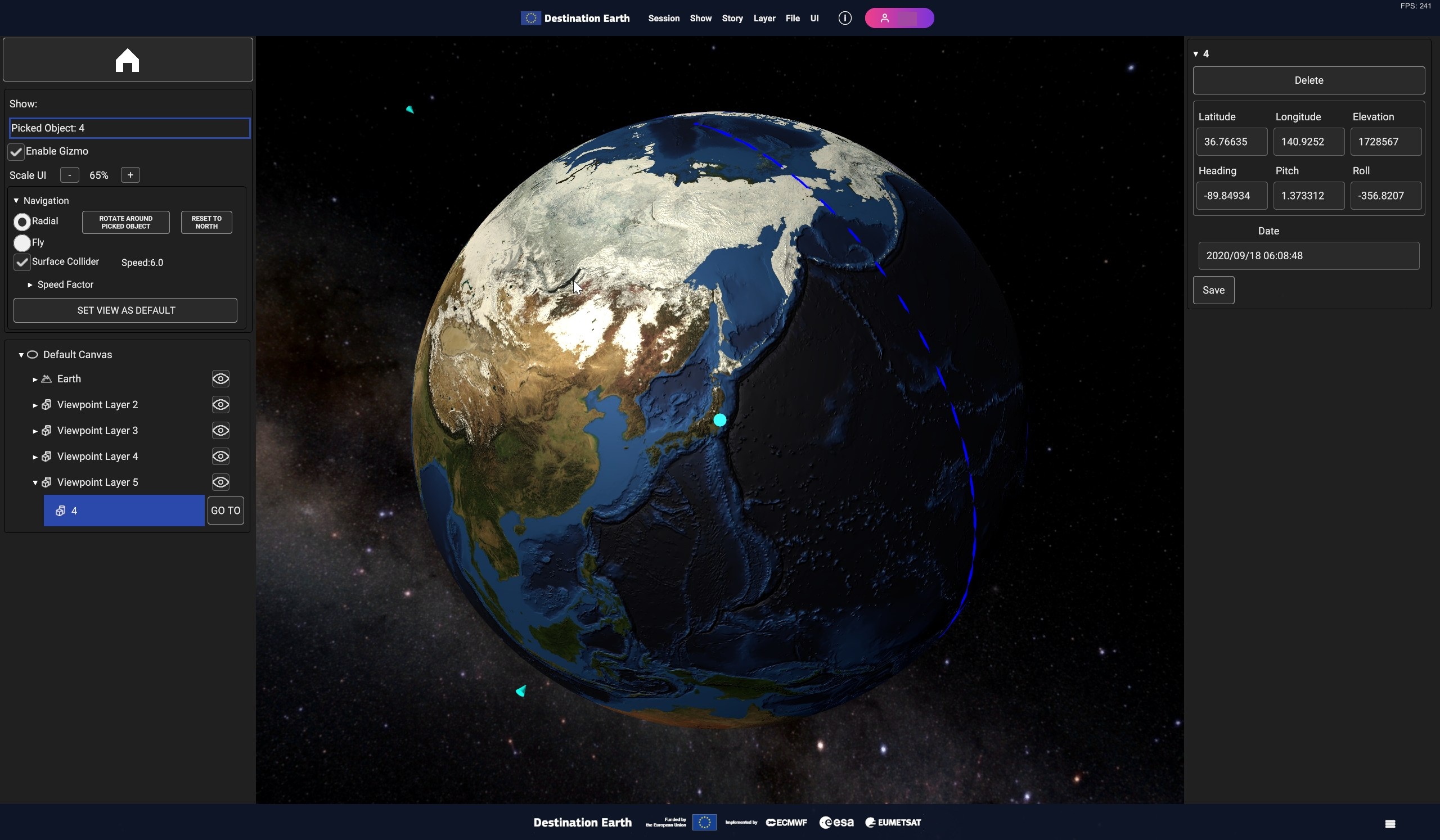
Fig. 5.42 A Viewpoint Layer with three viewpoints visible in the scene
5.2.5.1. Add Viewpoint Layer
Clicking on the Viewpoint option opens the Viewpoint Layer panel. Here, beside the usual canvas and layer properties, user can set the name of the layer, the position and the orientation of the point, and the time instant.
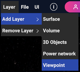
Fig. 5.43 Add Viewpoint Layer
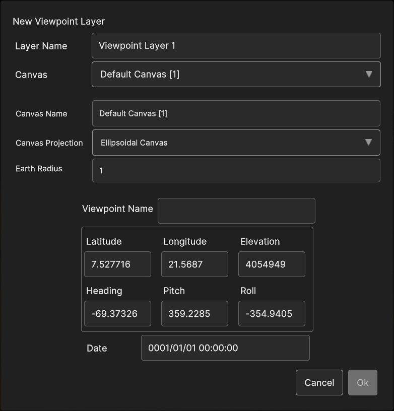
Fig. 5.44 Add Viewpoint Panel
5.2.5.2. Viewpoint Hierarchy Panel
A viewpoint in the scene displays a special button in the hierarchy, the GO TO button which sets the camera position in correspondence of the position and rotation of the viewpoint, and setting the current time to the viewpoint time.
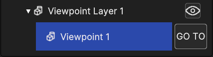
Fig. 5.45 Viewpoint GO TO button in hierarchy panel
5.2.5.3. Viewpoint Inspector Panel
The Viewpoint Layer Inspector Panel provides the options to add a viewpoint, through the Add Data Source Button, which opens up the relative panel, and to delete it with the Delete button.
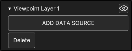
Fig. 5.46 Viewpoint Layer Inspector Panel
The Viewpoint Inspector Panel allows to delete the viewpoint with the specific button and it shows the same editable properties found in the popup panel. Changes can be discarded or confirmed with Cancel and Apply.
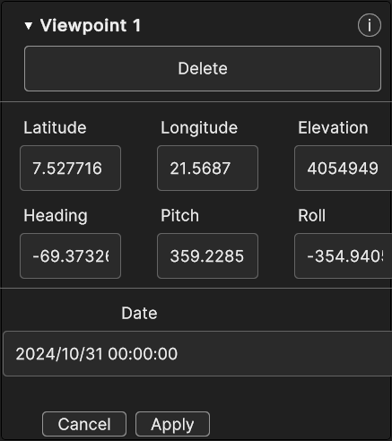
Fig. 5.47 Viewpoint Inspector Panel
5.3. Data Sources
- These are the existing types of Data Sources :
Images or Videos from local storage
WMS
User-defined JSON file from local storage
5.3.1. Image/Video Data Source
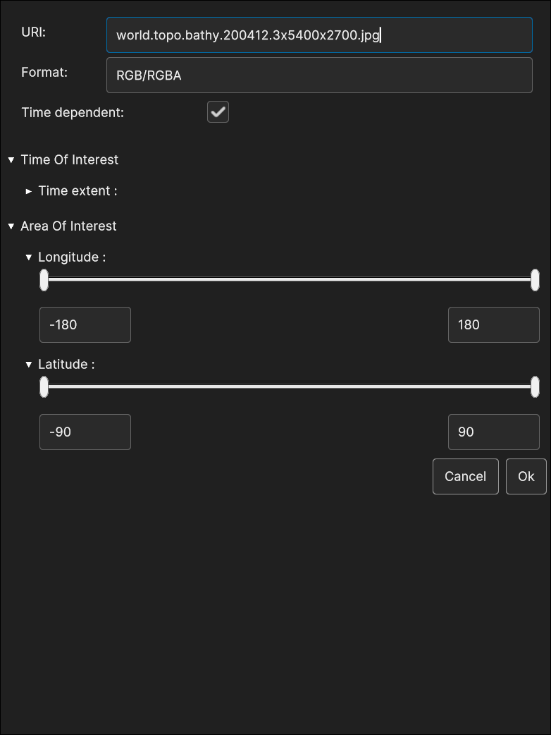
Fig. 5.48 RGB Image Data Source insertion
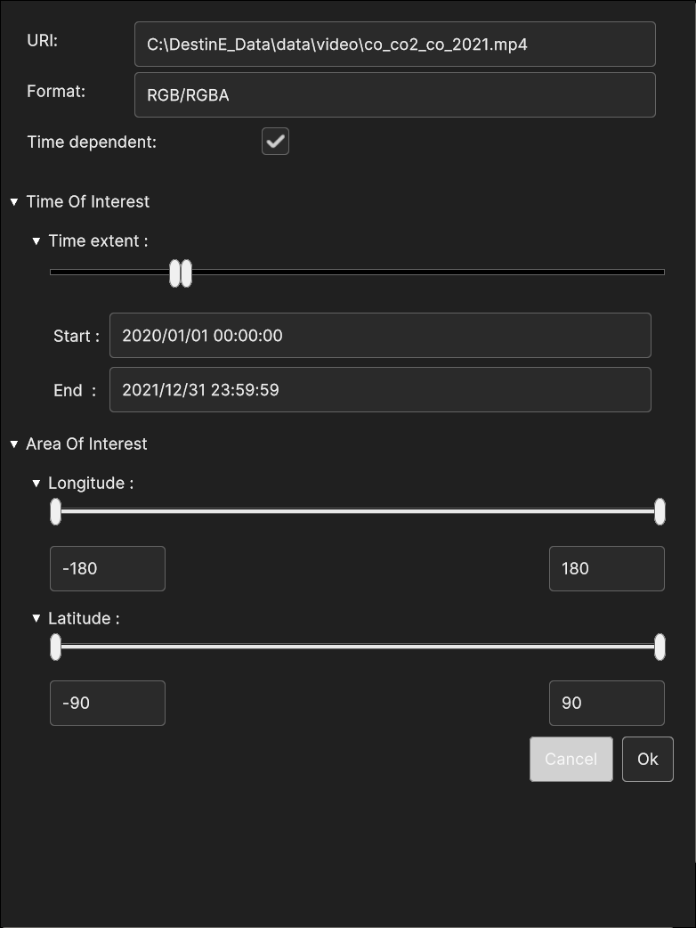
Fig. 5.49 Video Data Source insertion
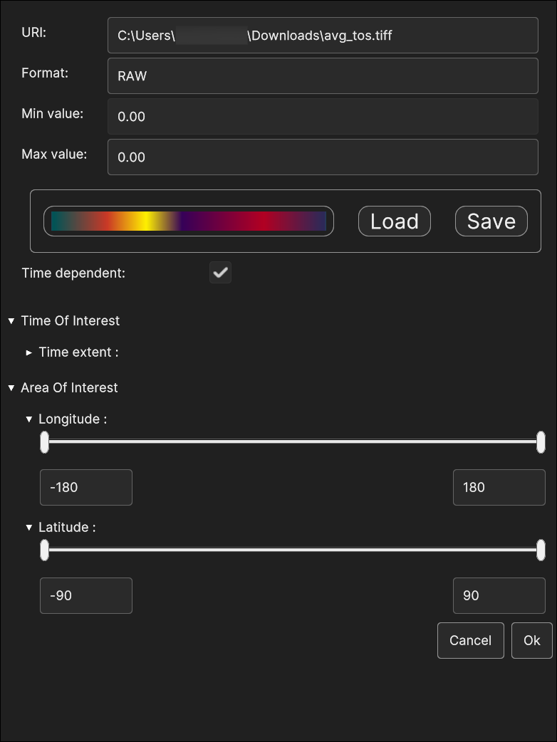
Fig. 5.50 GeoTIFF Data Source insertion
5.3.1.1. Image/Video Data Source Inspector Panel
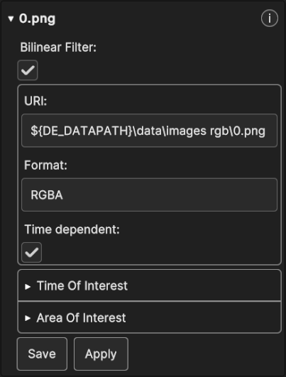
Fig. 5.51 RGB Image Data Source Inspector Panel
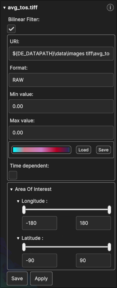
Fig. 5.52 GeoTiff Data Source Inspector Panel
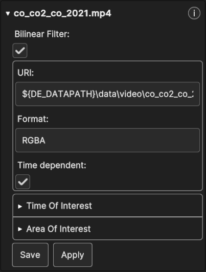
Fig. 5.53 Video Data Source Inspector Panel
5.3.2. WMS Data Source
To select WMS as a Data Source, the user can interact with the corresponding UI, which is available when creating the appropriate Layer. The WMS Data Source UI is exemplified in the following figure:
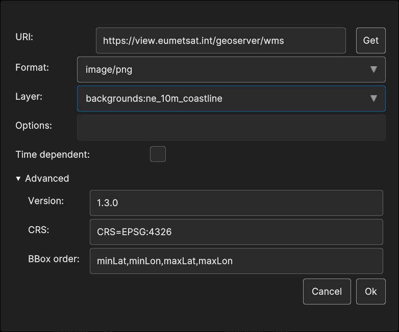
Fig. 5.54 WMS Data Source insertion
5.3.2.1. WMS Data Source Inspector Panel UI
The WMS Data Source Inspector Panel appears like this :
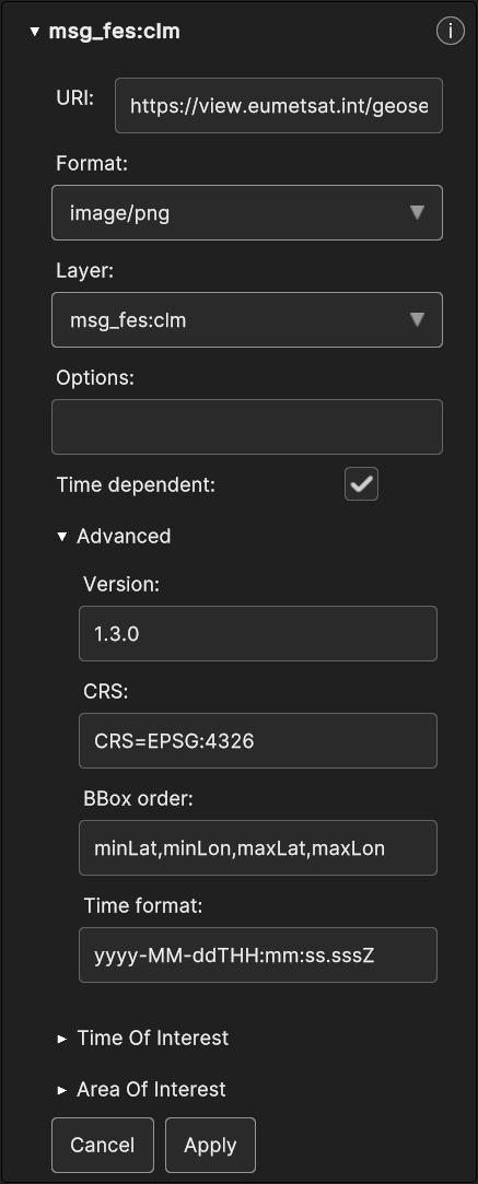
Fig. 5.55 WMS Data Source UI in Inspector Panel
All the WMS parameters are exposed to the user, although only Options, BBox Order and Time format can be changed, other than the Time Of Interest and the Area Of Interest.
5.3.3. Data Sources from JSON local file
You can save and load Data Sources locally as JSON files. You could potentially change manually or write a JSON file from scratch before uploading it, but this can be time consuming and prone to errors so it’s not recommended.