Analysis & Visualization
Once that a simulation is loaded, the user has several options at their disposal to further configure, explore or modify the visualization (Figure 21):
Open: Load additional simulation visualizations (up to 3) or load a scenario visualization. Loading a scenario removes all loaded simulations.
Configure: Show the Configure Visualization window, to select the parameters to visualize and in which datasets.
Configure the visualized layers/parameters: show and hide layers, configure the colour scale, etc.
Activate the split functionality with the ”Dual map view” button in the vertical button bar. The user can select which layer is shown on which side.
Open the legend for the loaded layers.
View parameter values for individual road segments or grid tiles by hovering over or clicking on them. If the parameter has been modified, the delta to the original value is shown in red (negative) or green (positive).
Use the timeline playback tool to observe parameter’s temporal evolution
For example, the figure below shows a comparison of NO2 between the baseline and the LEZ Emission scenario in Copenhagen. Since there are several layers open, the user might scroll down through the legend to check the values for each layer. There is also the possibility to hover over the layers to see additional information. The user can display another scenario for comparison, and therefore explore the same layer under different simulations and urban contexts (e.g. compare CO2 levels in a baseline scenario vs high-speed road redesign).
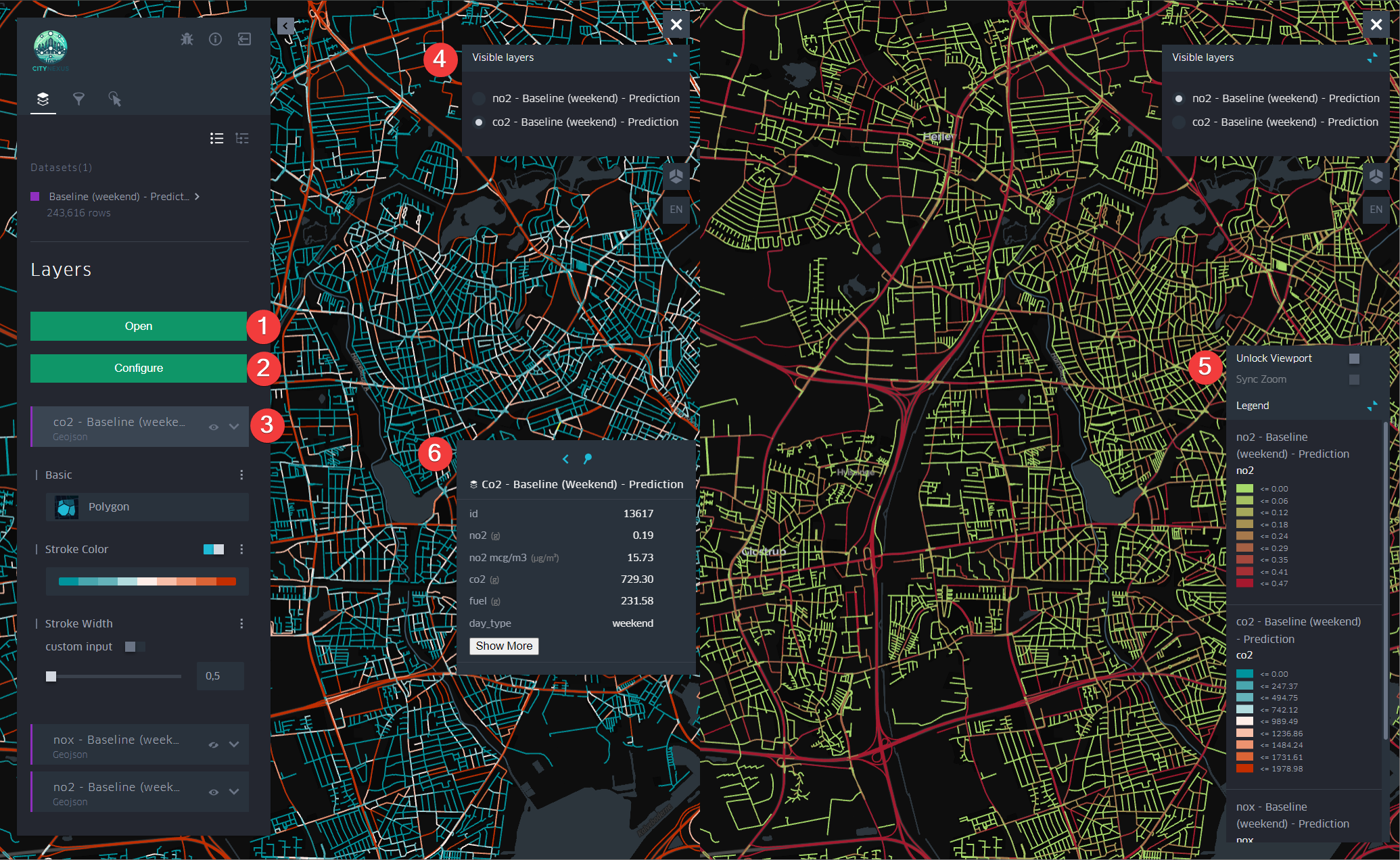
Figure 21 Comparative Analysis
Figure 22 shows the tutorial that can be displayed by clicking on the Help button at the bottom right of the screen. The tutorial explains step-by-step the functionality available for simulation visualizations.
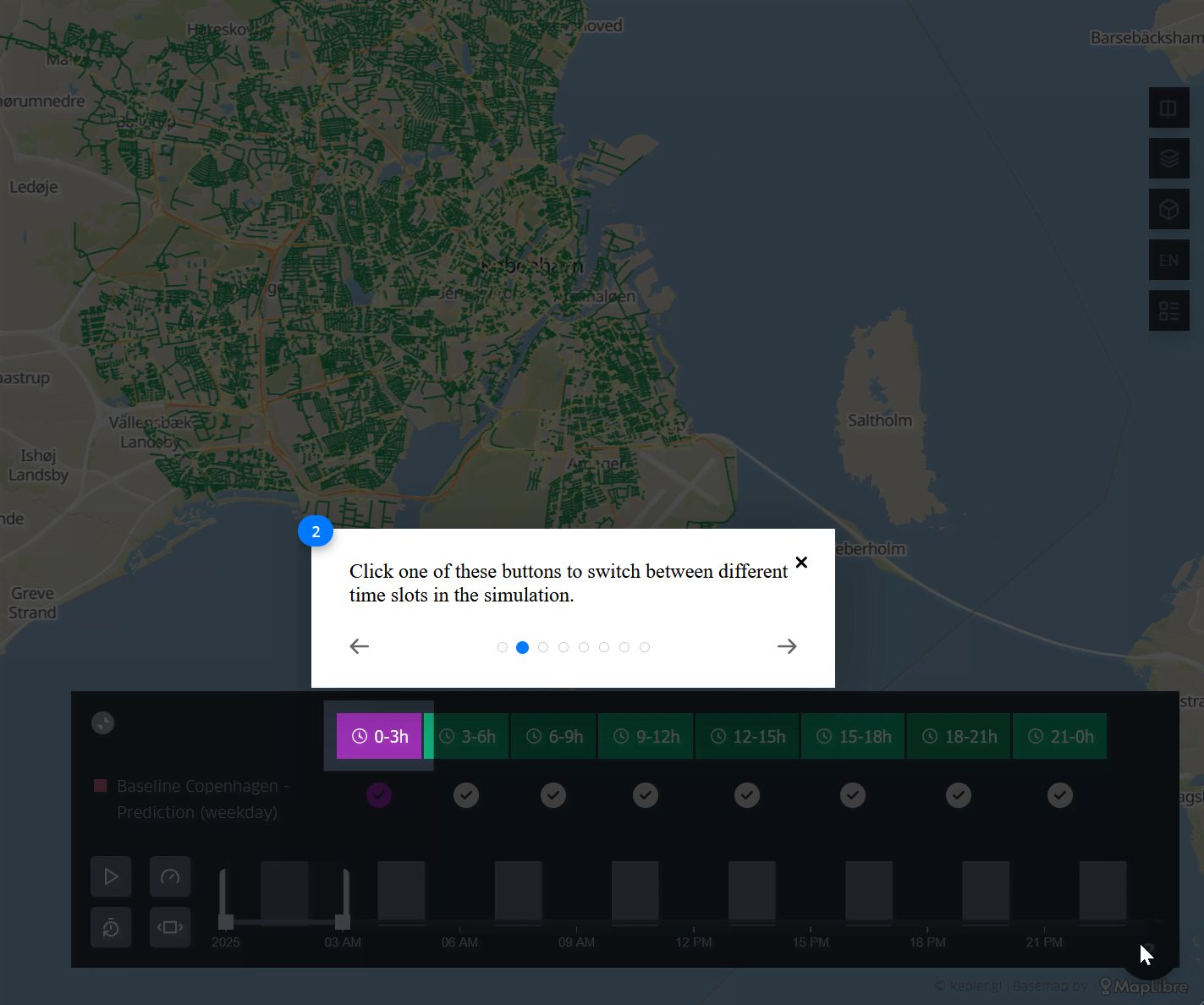
Figure 22 Simulation tutorial
In the left-side panel, expanding the details of a loaded layer gives access to detailed configuration possibilities for the layer, such as the colour scale, the opacity, the visibility, etc. (Figure 23).
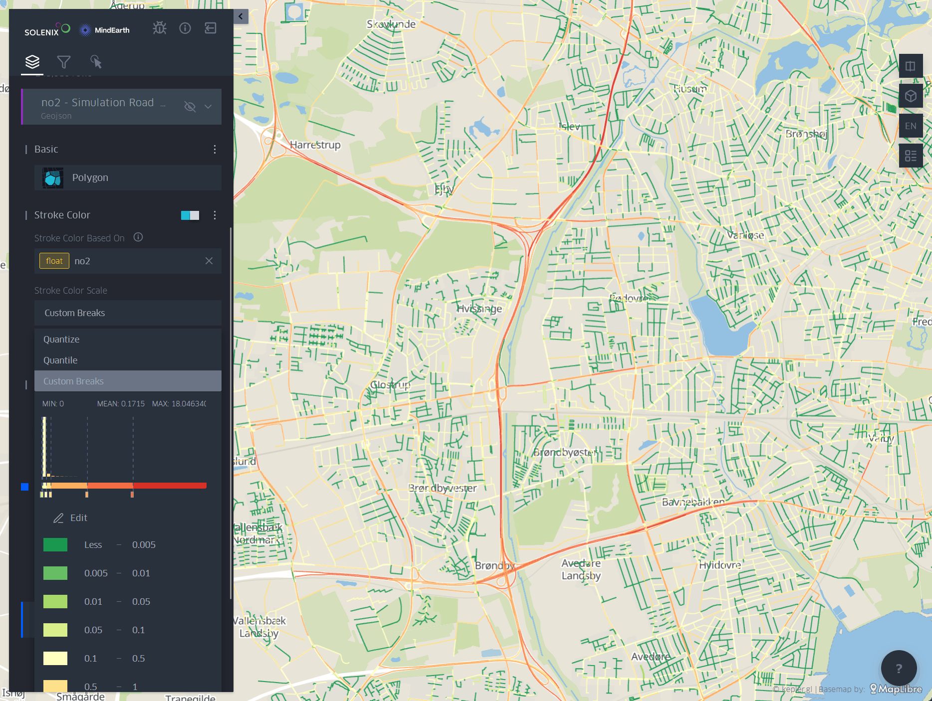
Figure 23 Colour Scale Configuration
Additionally, it is possible to use the Filter tool to create dynamic animations as explained in figures previously. In this case, an example is shown of the parameters that can be set to create an animation of Road Occupancy. First, the user can activate the filter to only show the streets that are being occupied, therefore in hours with less traffic some streets will disappear of the map as there are no vehicles passing by. Then, using the time scale filter, the user can set the timeframes to be visualized in the animation. To ensure a smooth and continuous animation, it is recommended to set the playback button to cover a minimum timeframe of 3 hours (Figure 24).
The user can expect to obtain results similar to those shown in Figure 25 and Figure 26. However, the reviewed settings can also be easily adjusted depending on what the user wants to explore or visualize.
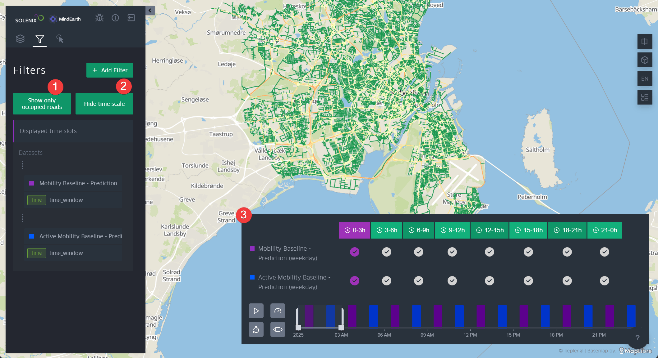
Figure 24 Example of filter settings for Road Occupancy animation
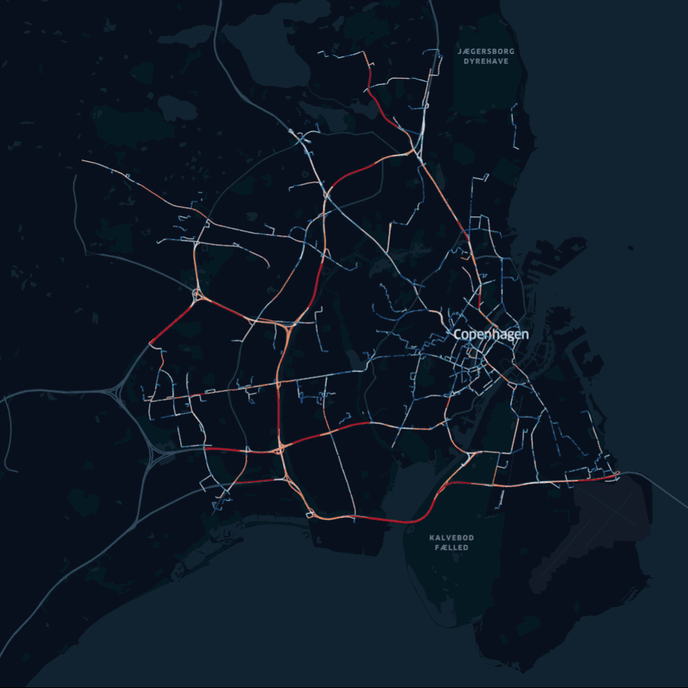
Figure 25 24h Road Occupancy Simulation
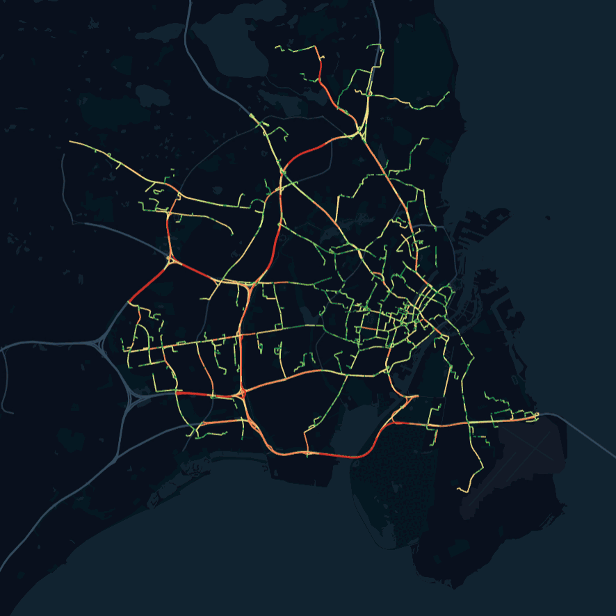
Figure 26 24h NO2 Concentration Simulation