Simulations Visualization & Interaction
CITYNEXUS PRO is hosted using the Kepler.gl environment. Kepler.gl is an open-source tool for visualizing large-scale geospatial data. It allows users to create interactive maps with multiple layers and temporal visualization animations. This documentation covers the basic features of Kepler.gl, but the user can find more detailed information here: https://docs.kepler.gl/docs/user-guides
Basic Visualizations
In the previous section we explained how to open and configure the simulation visualization. Once the configuration step is completed, the user will see their selected simulation and layers, and can start interacting with the simulation results (Figure 6).
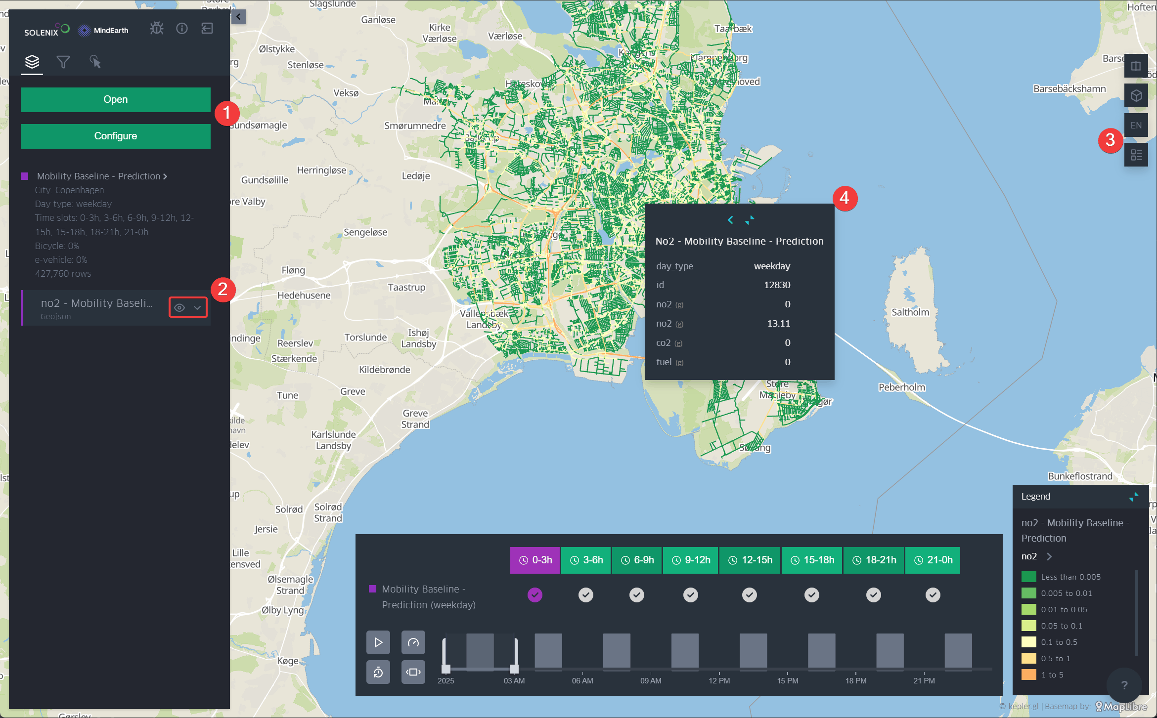
Figure 6 Basic layer visualization
The left-side panel is the main way to configure the visualization, filter and explore the data, load another simulation or scenario. To open a second or additional layer, the user must click “Configure” and select a new parameter. To switch scenarios, the user should click “Open” and select the desired one.
Just below, the user will see each open scenario and associated layers identified by a colour. The user can either decide to show or hide layers by clicking on the “eye icon”. The arrow just next to it will display more options to change the color scale, width, transparency, etc.
On the right-side panel, the user can open and pin the layer legend on the map, set a 3D view, and switch to a dual-map view for making comparisons between the data.
By hovering the mouse over a layer, the layer’s attribute information will be displayed. Also, by clicking “Show more,” the user can view all available information for the road segments.
Visualizing Flooding Simulation Results
Flooding simulation results can be visualized in two main formats:
as raster data showing water depth across the terrain, and
as vectorized data showing flood impacts (in mm of water) per road segment.
Both raster and vectorized flood layers support interactive features:
Click on any location to get detailed flood information (water depth, time of peak flooding)
Compare scenarios with and without flood defenses using dual-map view
Filter roads by flood status (e.g., show only roads with water depth above a threshold)
Temporal playback to observe flood evolution and recession
Raster Flood Visualization: The raster layer displays water depth across the entire simulation area as a continuous surface. This visualization shows:
Water depth in meters at each location
Effectiveness of flood defense structures in reducing water depth
Vectorized Road Flood Impact: The vectorized layer displays flood impacts specifically on the road network, with each road segment showing:
Water depth on the road surface
Speed and occupancy reduction due to flooding
Applying Filters
It is possible to add to limit the data that is displayed. There are two pre-defined filters the user can explore:
Show only occupied roads: this filter will hide hides all roads with 0 occupancy (Figure 7).
Show time scale: this will open the time window, which allows the user to scroll through the simulated time slots by increments of 3 hours.
Show roads with over 0.5m flooding: if relevant, this will hide all roads with less than 0.5m of water depth on the road surface.
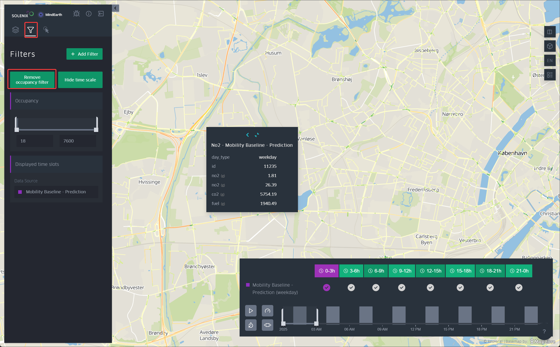
Figure 7 Road filter
For making a dynamic visualization, the time playback button must cover at least 3h time slots. Then, the user just need to click on the “play” button to see the animation. It is also possible to adjust the speed of the animation with the “rocket button” (Figure 8).
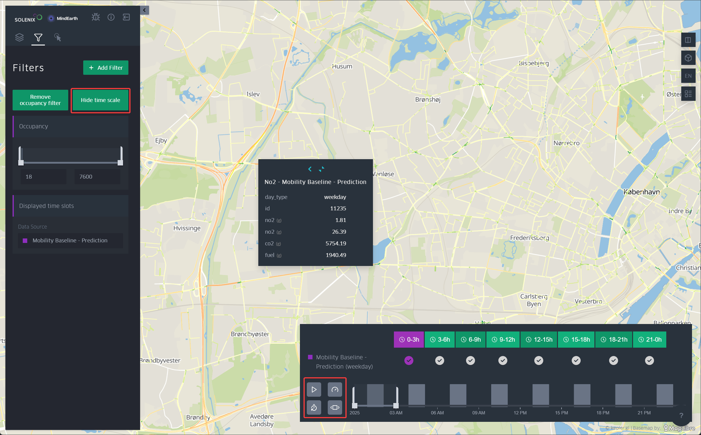
Figure 8 Time scale filter and dynamic visualization settings
Change Base Maps
The user can also customize the base map style. Options include: dark base map, light base map, voyager, etc.
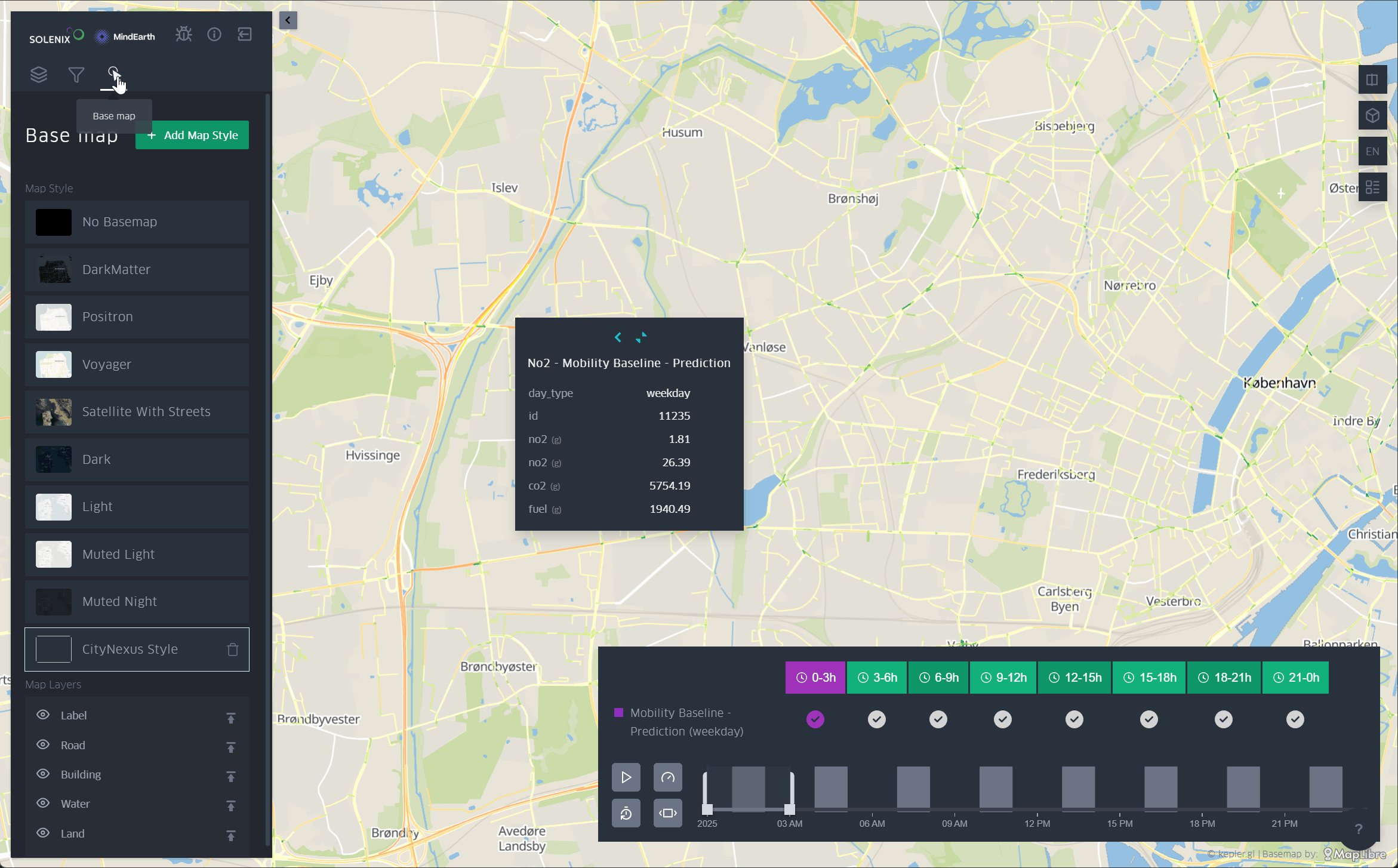
Figure 9 Base map settings
Dual Map View
In this section, an example is provided to show how to perform a visual comparison by displaying more than one layer at a time.
To do this, the user must first go to “Configure” and open the parameters they want to visualize. Then is necessary to make visible the layers they wish to compare by clicking the eye icon next to each layer (if they are not already activated).
Then, the user needs to go to the top-right side of the screen and click the “Switch to dual map view” button. This will enable a side-by-side comparison, and here will be necessary to select which layer to display in each window. The user may display different layers for the same scenario or the same layer for different scenarios.
At this point, the user can navigate the map and visually compare the values shown in each layer by hovering over the layers.
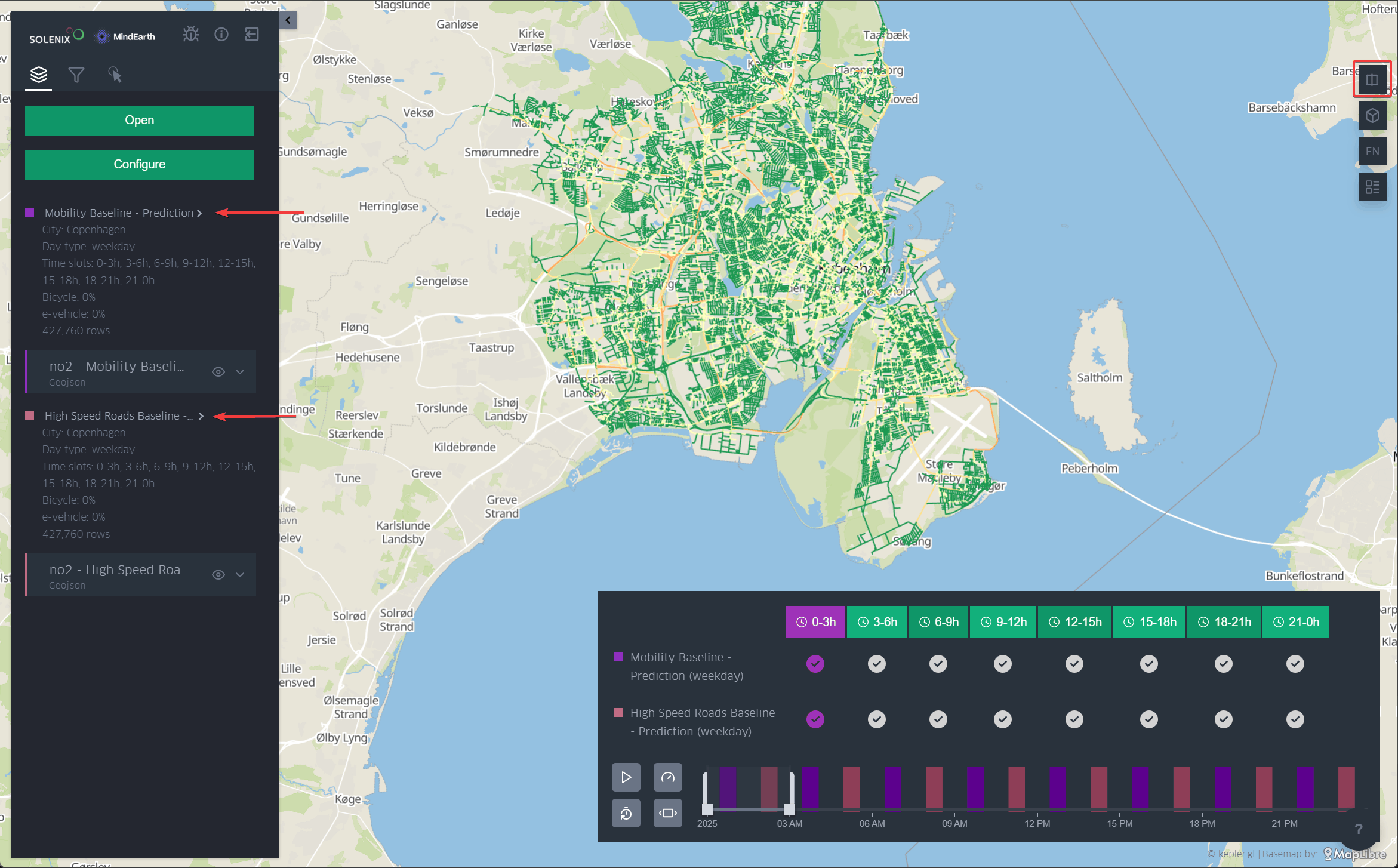
Figure 10 Dual map settings
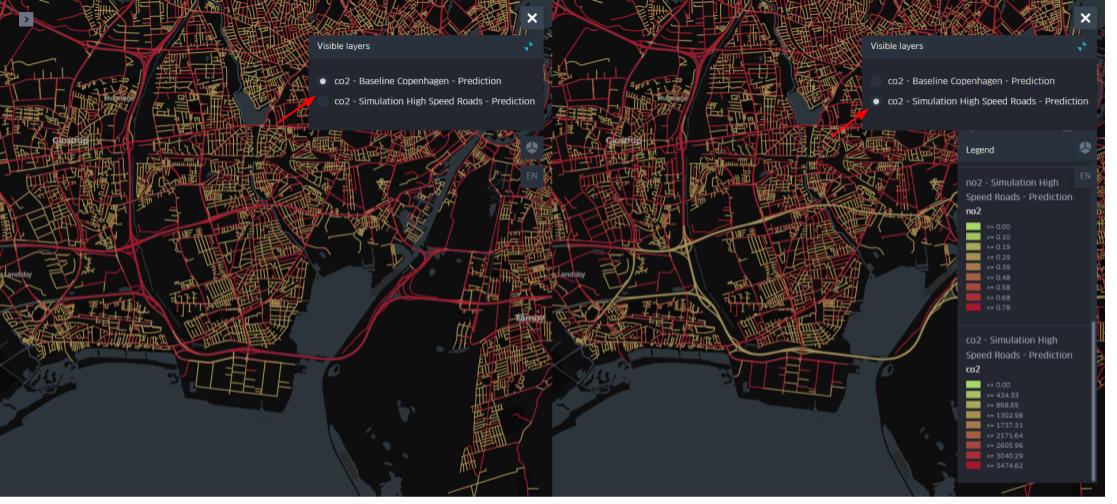
Figure 11 Dual map visualization